The championing and despising of typefaces, once a form of attitudinising mostly confined to printers, designers and typographers, has been democratised by the font menus on our computers. After decades of being a mark of respectable authority Times New Roman, made too familiar by being among the earliest digital typefaces, is now widely derided as stuffy and overdue retirement. Helvetica is practically a fetish object for some who admire its austere neutrality, the very qualities for which it is dismissed as bland by others. Another divider of opinion is Comic Sans. It is often mocked, but beloved by many, and now has name recognition to rival Helvetica and Times (and the mockery is usually unfair, to do not with the type itself, but its use in wildly inappropriate contexts). Many of us will use different fonts in different sorts of work, but some people find a typeface that suits them so well that they see no reason to ever use another.
Among the accusations of bullying levelled at the producer Scott Rudin by former employees and business associates, which prompted him to step back from various theatre, TV and movie projects last year, was that he would become furious when memos crossed his desk which were not printed in Garamond. Petulance made sillier if one considers that as an expression of sophistication, demanding Garamond is like insisting on ‘French wine’ : which one?
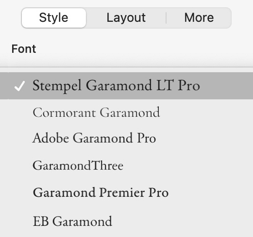
The name is now applied to dozens of revivals of French Renaissance typefaces, many of which have little to do with Claude Garamond (c.1500–1561). Some are based on type cut by his contemporary Robert Granjon, others on the work of Jean Jannon made more than fifty years after Garamond’s death, and others still that have been devised more recently for advertising and display purposes. Most of us would struggle to differentiate one from another, so perhaps Rudin would have accepted any of them. But even for those of us who care (perhaps too much) about the look of words on pages, reacting to a document having been typed in anonymous Helvetica or boring Times by throwing a tantrum (or worse, as variously alleged for similar infractions: a glass bowl, a phone, a serving of chicken salad) exceeds any reasonable definition of a demanding boss.
John Updike, who had studied drawing and typography at college, took a closer interest in the way his books were produced than most authors. He designed the covers of several of them and supplied detailed layout sketches for others. Included in Chip Kidd: Book One, the first catalogue of the designer’s work, is an illustration of Kidd’s proposal for the jacket of The Afterlife and Other Stories, embellished with Updike’s critique spread over a dozen Post-It notes. But despite this, and waspish notes to his editor (‘no Kiddian theatrics, please’) he clearly admired Kidd’s work: he wrote the introduction to Book One. Updike’s covers were often, though not exclusively, set in Albertus, but for the text Janson, based on type made by Miklós Kis in the late 17th century, was always preferred. Being required to use a particular typeface can be a disappointment to a typographer: decisions make designs, so removing choice from such a key element can rankle for those who want to put their stamp on a job. Sometimes there will be a subtle rebellion. Although the text of Updike’s last, posthumously-published collection, My Father’s Tears & Other Stories is set in Janson, the stories’ titles are in Perpetua and the running heads and folios in Electra. Three typefaces to set a text which would have worked perfectly well with two, and arguably even better with just one, seems like overkill. For designers less eager to make their mark it might have been a relief that preordained Janson is such a versatile and legible face.
Hermann Zapf (1918-2015) based his design for Optima on text he saw on a funerary slab at the Basilica di Santa Croce on a visit to Florence in 1950, making sketches of some of the letterforms on the only paper he had with him, a couple of 1000 lira banknotes. Lucky for him that he had some paper handy, and fortuitous for those who would market the type that he supplied a good origin story. There are a number of versions (and unauthorised clones) of Optima, and Zapf himself continued to update the typeface as new technologies emerged and to refine it where he saw improvements could be made. The printing historian Frank Romano remembers, on first meeting the designer, asking him what it was that he did, to which Zapf replied ‘I correct the errors of my youth.’
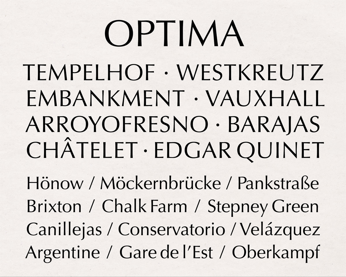
Optima is a commercial and popular success – it has been used in the branding of a long list of firms including Amblin Entertainment, Aston Martin, British Airways, Estée Lauder, and Marks & Spencer – but for some its blending of the aesthetics of serif and sans-serif type denote a lack of conviction. Erik Spiekermann, reacting to its adaptation for use by Yahoo! in one of that company’s serial rebrandings tweeted: ‘neither sans nor serif. Like a man with little self-confidence who wears both a belt & braces.’
In a 2008 blog post about the typography of the US presidential race of that year, Jonathan Hoefler declared himself mystified by its use in John McCain’s campaign material, describing it as ‘the font of choice for the hygiene aisle’. A valid observation (see above), but it’s worth pointing out that it had been used in at least one earlier political campaign, albeit fictional (see below) and, as Hoefler acknowledged, he had skin in the game: Barack Obama’s campaign that year used Tobias Frere-Jones’s Gotham, published by Hoefler&Co.
I have a grumble of my own about Optima. British book design for trade fiction and non-fiction since the middle of the last century, much influenced by Jan Tschichold’s tenure as head of design at Penguin Books from 1947 to 1949, has largely been a formally conservative business. The designer Ron Costley’s remark that his American counterparts were on a ‘relentless quest for a new place to put the folio’ is indicative of how British typographers tend to the unobtrusive, and it is books designed by them that I grew up reading and have grown used to. The layouts of Rachel Cusk’s trilogy of novels Outline, Transit and Kudos, and of her subsequent books, in most respects follow this modest British model, except for the choice of Optima for the text. My atavistic expectation that the text would be set in a Garamond, a Caslon, or even a tired old Times, meant that each time I opened one of the books, rather than being drawn in, I felt slightly rebuffed. Although after a page or two of reading my mind and eye would adjust to the text, right to the end of the trilogy, picking up the books anew caused the same slight dissonance.
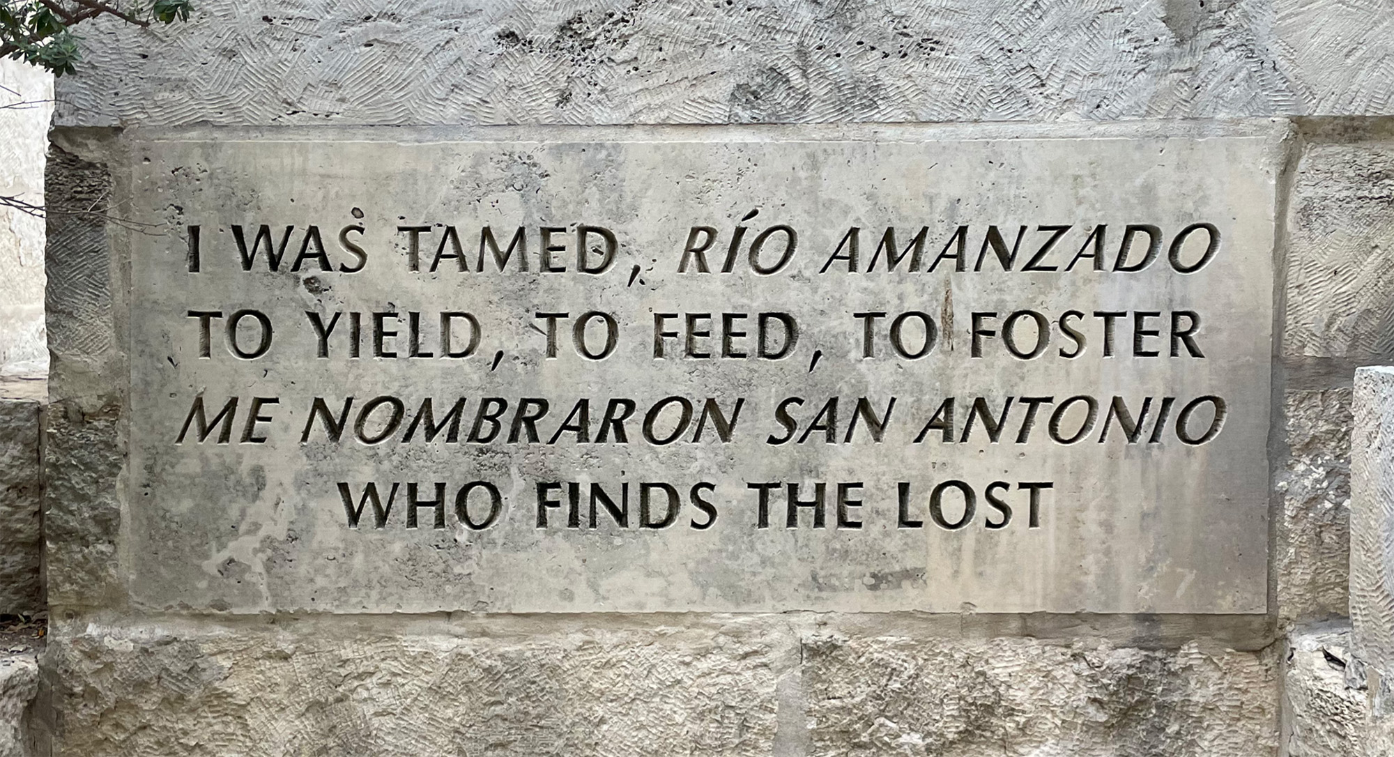
But context is important and Optima still has much to be said for it. Having come full-circle, it can now be seen doing what the original that inspired it was made for, in the restrained, sombre text of monumental inscriptions. As well as on public art like the plaque shown below, letterforms from a Florentine tomb now inscribe the names of the American dead on the Vietnam Veterans Memorial in Washington DC, and the victims of the World Trade Center attacks at the September 11 Memorial in New York.
¶ Notes. I don’t know of a more compelling defence of Vincent Connare’s Comic Sans than Mike Lacher’s channelling of the font at McSweeney’s. ¶ Sources. Michael Paulson & Cara Buckley on Scott Rudin (New York Times, 24 January 2021); Rachel Berger on John Updike’s book covers (AIGA Eye on Design, 9 August 2022); Chip Kidd: Book One (Rizzoli, 2005); Frank Romano: Phototypesetting and the Second Revolution in Type (Type@Cooper’s Herb Lubalin Lecture Series via YouTube); Jonathan Hoefler on the fonts of the 2008 presidential campaigns (typography.com, 22 February 2008). ¶ Images. With the exception of those including a copyright attribution in their captions, any images included in this post may be used under the terms of the Creative Commons CC BY 4.0 license.