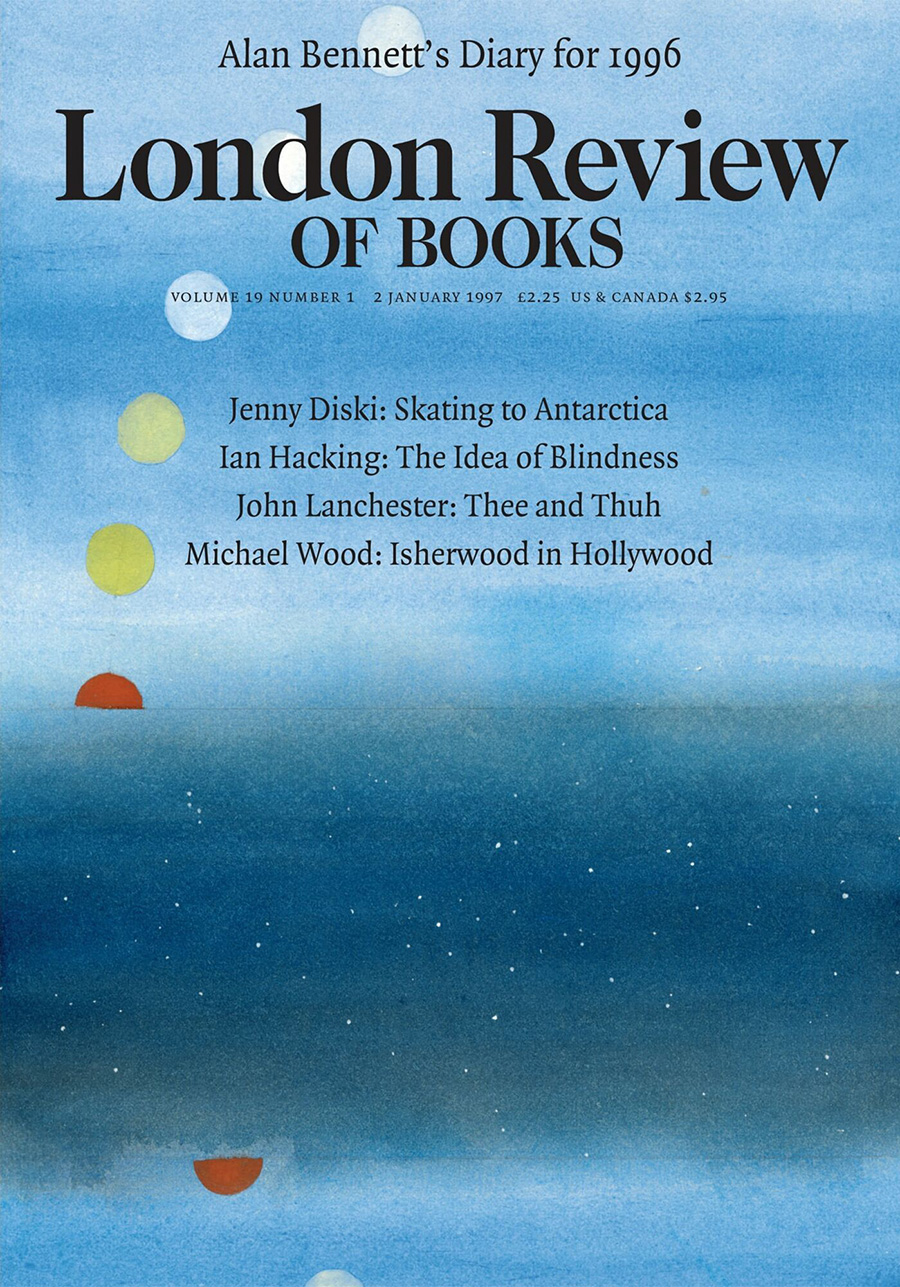
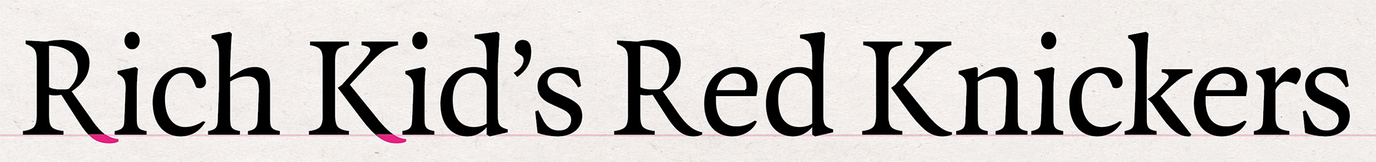
As much was retained as was changed in the 1997 redesign of the London Review of Books. There were no editorial innovations: the table of contents remained undifferentiated, giving the same emphasis to contributions be they book reviews, essays or poems. The Caslon masthead stayed, as did the four-column layout, itself indebted to, if not precisely inherited from, the design of the New York Review of Books, which had been instrumental in the launch of the LRB in 1979. The page size was reduced a little, and some symmetrical discipline was imposed: articles were no longer allowed to end in a single column, forcing the next piece to begin over three columns of the same page. Poems were given more room to breathe, being set in airy boxes, rather than, as had sometimes happened, appearing to be fillers for short-running columns. The range of type, which had been a bold version of Plantin for headings and drop capitals, Times New Roman for body text, and a movable feast for the words on the covers, was slimmed down to a single face, Quadraat designed by Fred Smeijers.
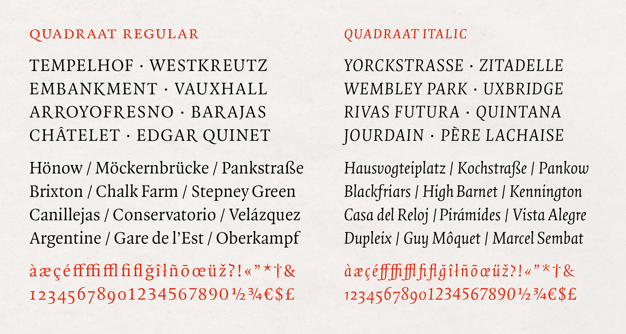
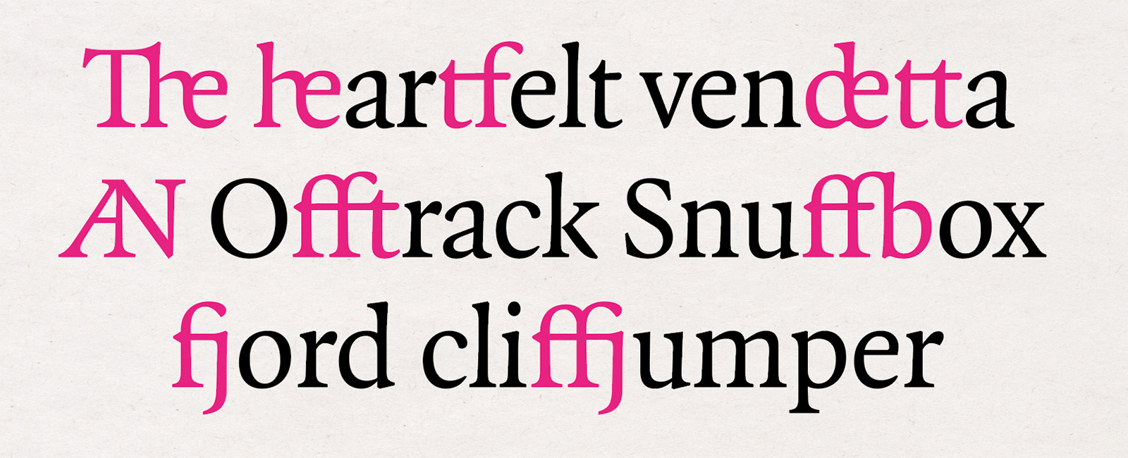
Released in 1992, less than ten years into the era of digital type, Quadraat arrived in a less crowded marketplace than a new face does now. The exact number of digital typefaces is unknowable, but it’s certain that there are now well over 100,000 comprised of, by some estimates, more than a million fonts. But Quadraat was up against established players, familiar to designers and art directors who might not have seen the need for yet another book face. It has proved a success, valued for its many merits. It is compact (the italic exceptionally so) which is important for papers like the LRB where the four column grid makes a narrow measure. There are glyphs to set most European latin and cyrillic alphabet languages, and as well as all of the standard ligatures, some less common and more outré ones.
In addition to old-style and lining figures it includes a rarer small capitals lining set, useful, for example, when one wants a line of type to do double service, not just as words and figures, but also to separate one part of a page from another, to appear almost as a rule made of letters and numbers. In the issue date and price strap shown in the middle of the image below, lining figures would be much taller than the small caps, and the ascenders and descenders of old-style figures would variously rise above and fall below them.
In a piece for Print magazine in 2011 Paul Shaw included Quadraat in a list of ‘flawed typefaces’. He made it clear that by this he didn’t mean type that was bad, or even mediocre, defining a flawed typeface as one that a typographer might avoid because it features a questionable design decision. The inherent vice he identified in Quadraat was the leg of the roman R, which descends noticeably below the baseline. For newer releases, Quadraat can be struck from Shaw’s list. In Quadraat Pro, the version issued soon after his article was published, the default style is still the swooping one, but it includes a baseline-hugging alternative.
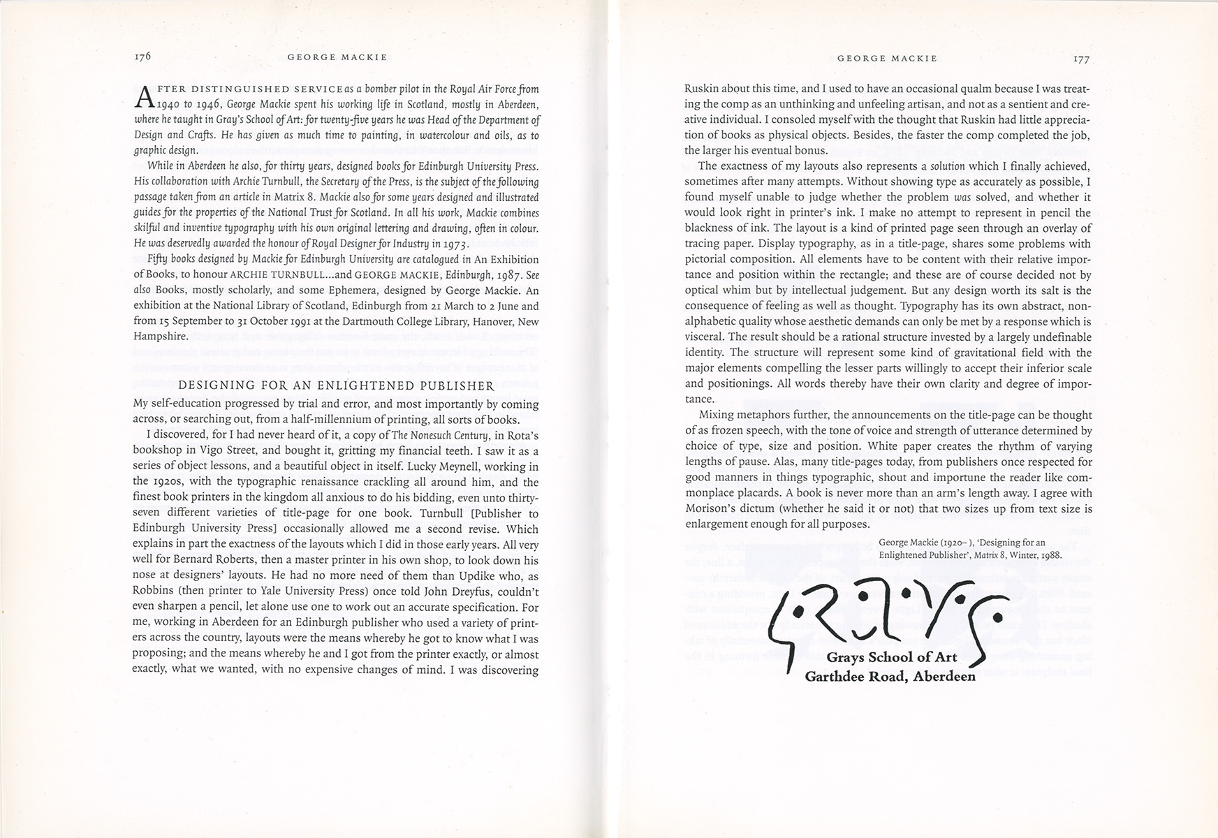
Quadraat might not ever become as prevalent as Bembo, Caslon or Garamond (and those of us who use it can’t deny that its relative exclusivity is among the traits we value it for) but it is clearly thriving. Before the LRB started using the face, it had already caught the eye of serious typographic people: in 1995 Ruari McLean chose it for the design of his anthology Typographers on Type: just the sort of encouraging endorsement a young typeface needs.
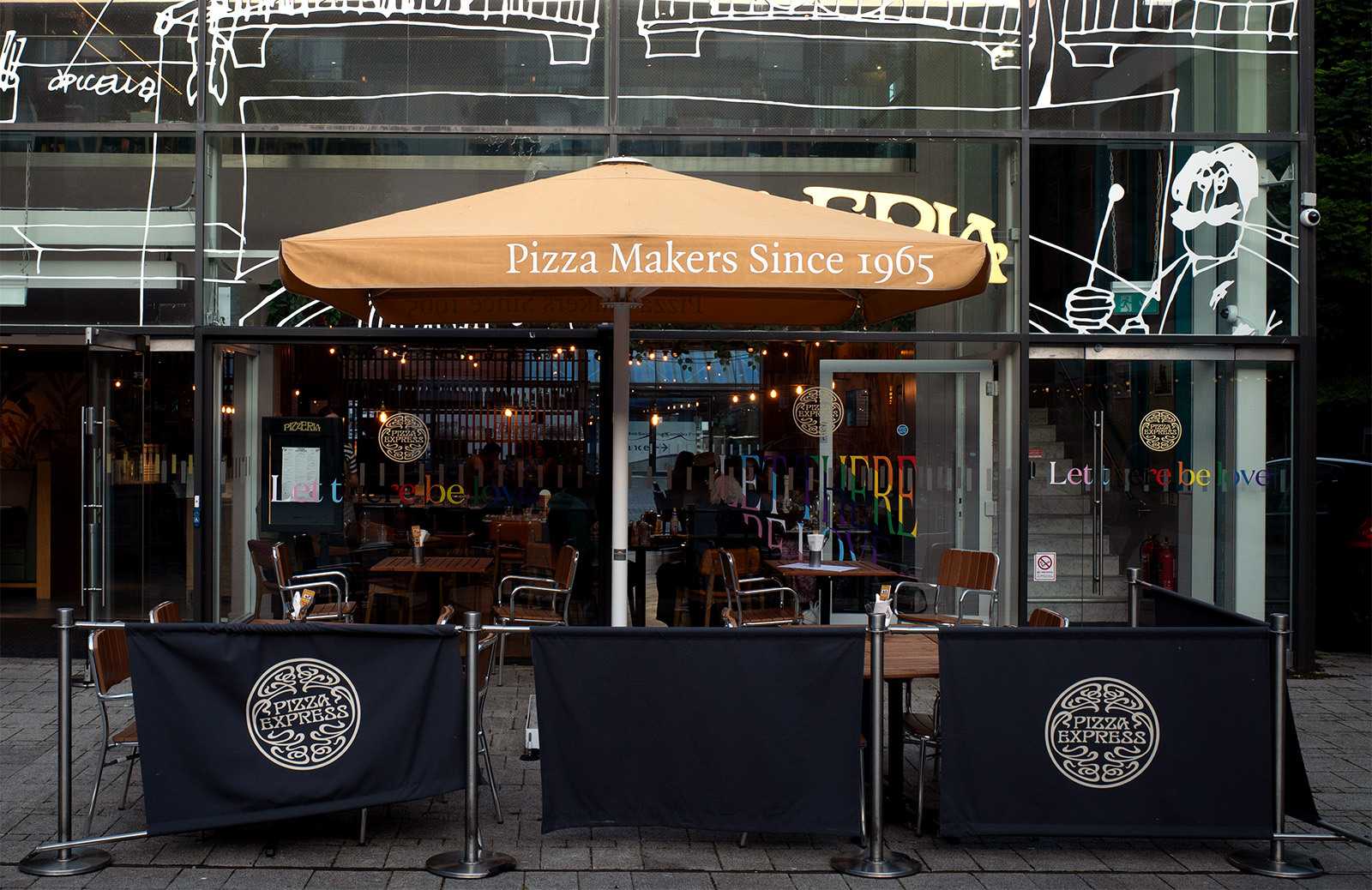
And it’s not just for the snoots: Quadraat is gaining a lively presence outside literary journalism and the typographic smart set. I recently got a snap of it in the wild on a walk through my neighbourhood, where it was hawking pizzas.
Fred Smeijers has said that he designed Quadraat to fill a gap in the typographic palette, one he saw as existing ‘somewhere between Plantin and Times’. Proportionally, it fits there: lighter than Plantin, heavier than Times. But structurally, it doesn’t owe much of a debt to either face. Jan Middendorp has described it as having ‘classical proportions but very contemporary and idiosyncratic details’. Robert Bringhurst wrote that ‘it is not pretty; its beauty is deeper and stranger than that.’ Erik Spiekermann agreed, noting that, in large sizes, it ‘looks as strange as the double “a” in its name’ but that it succeeds thanks to ‘little quirks to delight the tired eye.’
Is there a more pertinent term than ‘idiosyncratic’, ‘strange’ or ‘quirky’ to describe its visual quality? Maybe a differently imprecise one, found outside the alphabets which Quadraat encompasses, would be better : 侘寂 which translates as wabi-sabi. The Japanese term, a you-know-it-when-you-see-it conjunction of the austere (wabi) and the rustic (sabi), can nicely describe something that has been carefully made, but not polished until its surface no longer shows the marks of its making. I have been setting pages with Quadraat for more than a quarter of a century and I still like the feel of its rough edges.
¶ Notes. The original design of the London Review of Books was by my father Peter Campbell, working from a specification from the paper’s first editor Karl Miller. Peter was also responsible for the 1997 redesign which, with a few minor modifications, is the layout that the paper still uses; print and digital projects using Quadraat can be seen on Fonts in Use; Quadraat is available from TypeBy. ¶ Sources. ‘Flawed Typefaces’ by Paul Shaw (Print, 12 May 2011); Dutch Type by Jan Middendorp (010 Publishers, 2004); The Elements of Typographic Style by Robert Bringhurst (Hartley & Marks, 2012); Stop Stealing Sheep by Erik Spiekermann (The Other Collection, 2022). ¶ Images. Covers from the London Review of Books © LRB (London) Ltd; spread from Typographers on Type © Lund Humphries Publishers; other images included in this post may be used under the terms of the Creative Commons CC BY 4.0 license.