The technical contract rider Van Halen presented to venues where they were performing in the 1980s ran to many pages. Most of it concerned how to manage construction, safety and security of the huge stage, lighting and sound rigs for their shows (in his autobiography Van Halen’s lead singer David Lee Roth described the truck-loads of equipment as weighing ‘the business end of a 747.’) Buried within the contract was a MUNCHIES section specifying the required backstage snacks. It included, among the potato chips, pretzels and candy, the demand:
M&Ms (WARNING: ABSOLUTELY NO BROWN ONES)
At first sight, a bit of capricious rock ’n’ roll nonsense, but in fact a smart way to see if the contract – which included measures to preserve life and limb, of not only the band, but also the stage crew and audience – had been carefully read. A quick rifle through the M&M bowl would give a good indication as to whether the whole set had to be checked.

Buried within some digital fonts, particularly conversions of ones from the eras of metal and photocomposition, are alien marks unrelated in design to the rest of the typeface. Often the glyphs didn’t exist in the originals: the fonts were created for print uses where they would occur rarely if at all. The copyright symbol might appear only once in a publication, in most books only on the imprint page. Even there a parenthetic (c) might be used. These days books will usually have a © on the jacket for the cover art, and often more than once on the imprint page if there’s a translator or an introduction. Rights owners often insist on the copyright mark when newspapers and magazines reproduce photos or works of art. Practically every webpage will have a © in its footer. @ used to dwell in a typographic backwater, but is now indispensable for email and social media.
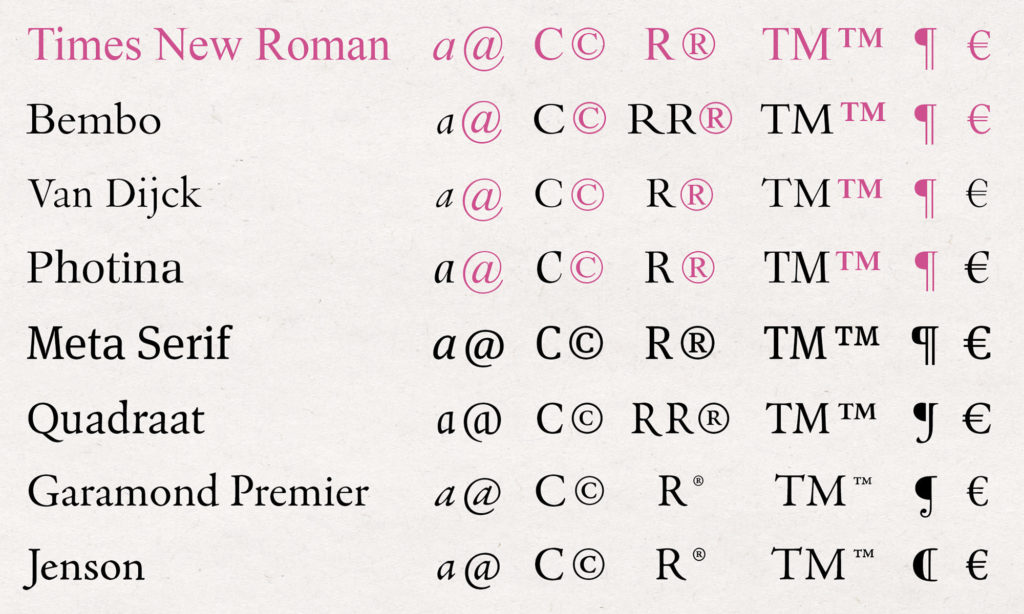
These remnants – typographic brown M&Ms – are sometimes included in more recent OpenType releases (which often have ‘Pro’ appended to the typefaces’ names) and are what to look for if one thinks they matter, or want to be sure there aren’t other problems lurking within the font (limited character sets, lack of standard ligatures and small capitals, erratic metrics and so on). This wouldn’t necessarily be apparent from looking at the samples that online sellers publish, which are, of course, fashioned to show the type to its greatest advantage. The first four examples in the table below are from versions now available in Monotype’s library. Glyphs from Times New Roman, shown in pink, show how that ubiquitous typeface has infiltrated others.

- @ is usually formed by the single-storey a (normally the lowercase italic, sometimes adapted to be less oblique) with a tail looping around itself. In Meta Serif and Quadraat the a parts of the glyphs have been elegantly simplified.
- © is usually an encircled adaptation of the uppercase C, occasionally more like the lowercase one. Times’s © is the most cluttered of those shown, with the letter’s top serif very close to the enclosing circle (perhaps a fussy observation, but no one is more focused on detail than type designers.)
- ® the registered trademark symbol is also an encircled adaptation. Bembo and Quadraat both have alternate versions of the letter R. In Quadraat, the less emphatic one (without the leg dipping below the baseline) is used for the symbol. The version of Bembo here has the Times one.
- ™ the unregistered trademark symbol. The sizing and alignment of this and ® differ according to foundries’ styles. Adobe’s match the rest of the font, but are much-reduced in size compared to other glyphs, so although nicely proportioned, they might be practically illegible when set in small sizes.
- ¶ the pilcrow. Even if one might rarely use it, is a nice opportunity to demonstrate something of the style or historical period a typeface is referring to. Meta Serif’s machine-age hint of a super-ellipse and Jenson’s renaissance form are particularly good.
- € came along in 1999 and it is essential to almost all Latin fonts released or updated since then. The top and bottom finials of the € generally echo those of the capital C. Appropriate glyphs have been retrofitted to Photina and Van Dijck, but Bembo’s is taken directly from Times.
In 2005 Monotype released an improved digital version of Bembo – Bembo Book – redrawn to be more sturdy, better-reflecting the qualities of the metal version for offset printing. It also has conforming glyphs rather than the Times ones shown here. I bought a license to the older version: I should have checked the @&©s before I agreed to the T&Cs.
¶ Sources. There is more information about Van Halen’s technical contract rider in this Snopes fact check. ¶ Images. Any images included in this post may be used under the terms of the Creative Commons CC BY 4.0 license.