
The sign above Peggy’s Cafe was uncovered for a while when this building in Brighton was being refitted. It hasn’t really been a cafe for at least 20 years: most recently it was a take-out pizza and burger place. By the look of them, the words date to the 1960s or 1970s. Hardly a landmark of sign-writing craft, but it’s cheerful and nicely done. It will probably be removed or covered over again soon, which is why I bothered to take a photo of it. A few years ago, I took a snap nearby when Channel was revealed during a renovation.
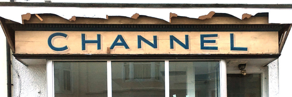
It must have been done at around the same time as Peggy’s, and the similarity of the pale drop-shadow suggests it might even be the work of the same local sign-writer. Again, no masterpiece, and maybe not worth making a fuss about, but what replaced it was even less distinguished (and is already gone).
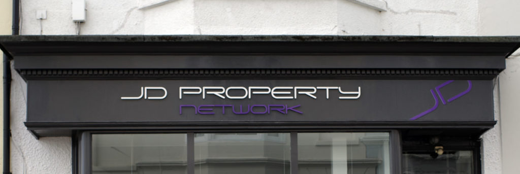
If signs are thought to merit preservation by the city’s planning department, they are usually saved one way or another. Often this is achieved by simply boxing in the old words and putting new branding on the box. Sometimes the sign is allowed to stay. A. Billet & Co is now a bar called L’Atelier du Vin, whose proprietors have sensibly decided that the charm of the sign above the door needn’t be sacrificed to the name of the business behind it.
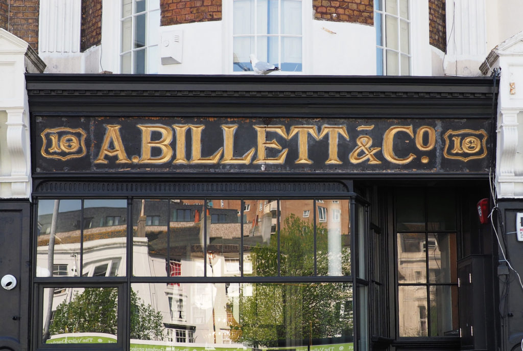
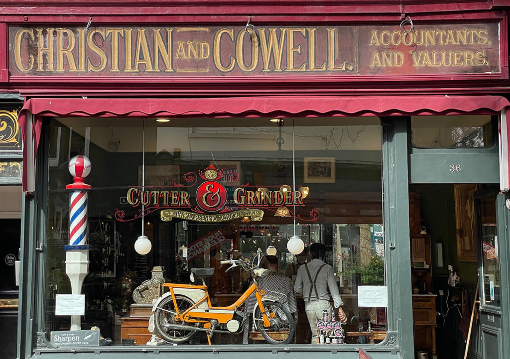
Since its original service for accountants and valuers, the sign for Christian and Cowell must have survived above numerous businesses. Until quite recently it was a second-hand bookshop. The current tenants, Cutter & Grinder, The Art of Barbering School & Shop have turned out to be good custodians, creating a graphic identity of their own which echoes the old hoarding.
Unluckier hairdressers were the barbers at Trafalgars who had a tricky problem when they took on the lease of their salon. The only part of the original livery that remains visible there is the street number.
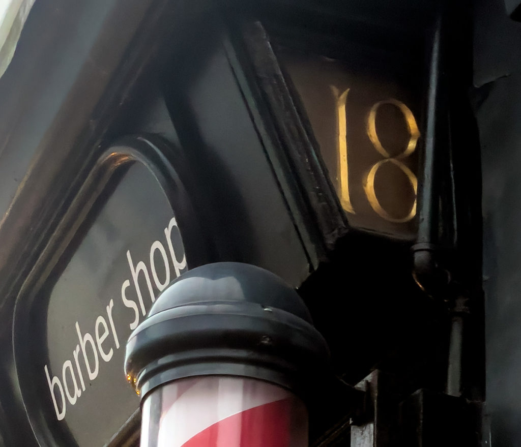
The main part of the sign, laid out much as it is below, used to read, in the left-hand lozenge: Dispensing Chemist; in the big, middle one: J. Barker; and in the right-hand one: Practical Phrenologist. It was decreed by the planning department to be an ‘important architectural feature’ which should be retained. But the Royal Pharmaceutical Society of Great Britain wasn’t happy that the words Dispensing Chemist appeared on the facade of a business that was not one (the RPS has form with this sort of thing : a few years ago they got antsy about a Damien Hirst-backed restaurant called Pharmacy.)

The solution here was a version of the boxing-in method: covering the old, glazed lozenges with vinyl patches to conceal and preserve the sign while sparing the dispensing chemists’ feelings. What, if anything, the phrenologists had to say about the affair is not recorded.
¶ Sources. The Argus, 28 December 2007. ¶ Images. Any images included in this post may be used under the terms of the Creative Commons CC BY 4.0 license.