On Ligatures

Typographic glyphs have their moments. The @ symbol was barely used before it became indispensable for email and social media. The creation of the single European currency saw thousands of fonts being reissued to include € at the turn of the century. It’s likely that some crypto-boosters are hoping this will happen again, and the double-barred B of Bitcoin will become de rigueur in fonts. Sometimes new forms arrive more surreptitiously.

Standard ligatures / Centaur MT Pro

In digital versions of Latin alphabet fonts ligatures, or ligs, the neat typographical devices which combine two or more characters into a single glyph, fall into two classes. Standard ligatures – usually ff, ffi, ffl, fi and fl – solve the problem of the overhanging hook of the lowercase f by tidily com­bining it with the following letter. Discretionary ligatures such as st and ct, based on once-common historical models, can look antiquated, hence a pre-digital name for them: quaints. The unobtrusive standard ligatures are now a feature of most old-face (serifed) fonts. The more con­spicuous discretionary ones are rarely used in body text in modern type­setting, most often being reserved for ads, book jackets, headings, title pages: places where there is the reason and space for decorative flourishes, and where brisk continuous reading isn’t a consideration.

Bible in Latin / Johann Gutenberg, Mainz c.1455
42-line Bible / Johann Gutenberg, Mainz c.1455

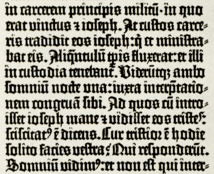
As constituents of the typecase ligatures were subject to a long diminishment over the centuries. Blackletter fonts, the earliest form of moveable type in Europe, usually included dozens of them. Gutenberg’s Bible had more than fifty, although the type is so tightly fit it’s sometimes difficult to distinguish them from individually cast letters.

Eusebius, ‘De Evangelica Praeparatione’ / Nicolaus Jenson, Venice 1470
Eusebius, ‘De Evangelica Praeparatione’ / Nicolas Jenson, Venice 1470

There were fewer in the looser-fit roman and italic fonts that came later in the fifteenth century, and fewer still when manual composition of type was practically superseded by hot metal setting at the end of the nineteenth century. From the middle years of the twentieth century, in many of the fonts made for photocomposition they had all but disappeared. Unconstrained by the physical restrictions of cast metal, this was when it became possible, if unadvisable, to plonk bits of one character over parts of another.

Ligatures were absent from the limited character sets of the very earliest digital type which arrived at the beginning of the 1980s. (Italics were some­times missing too, these being poorly mimicked by the roman font given an oblique slant.) But by the end of the decade most commercial fonts, or at least ones which a designer might be willing to pay for, had reinstated the standard ligs.

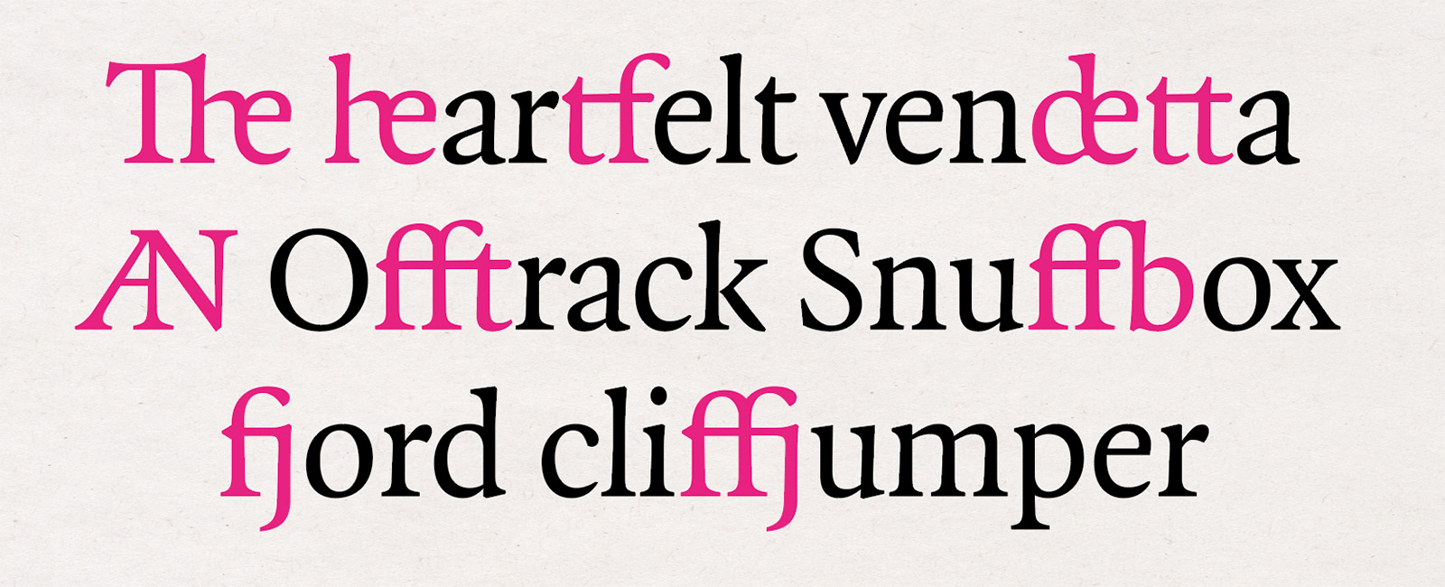
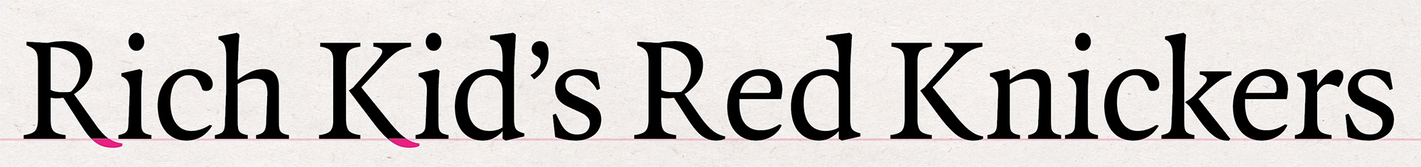
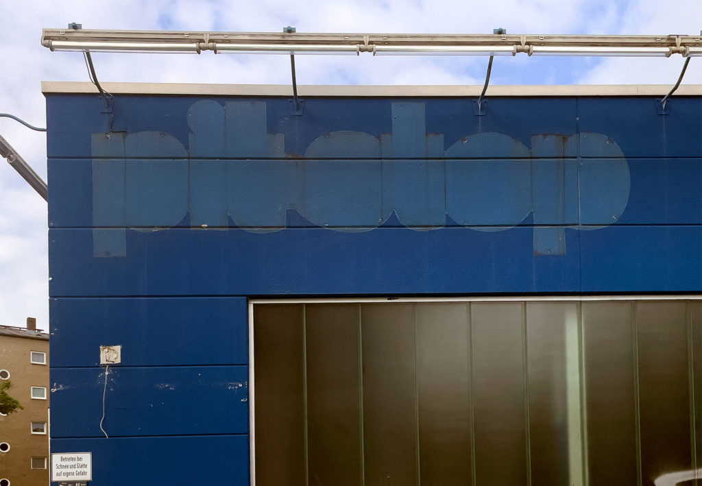
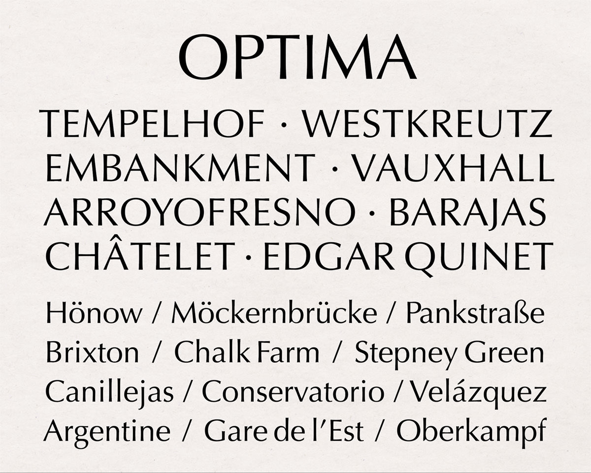
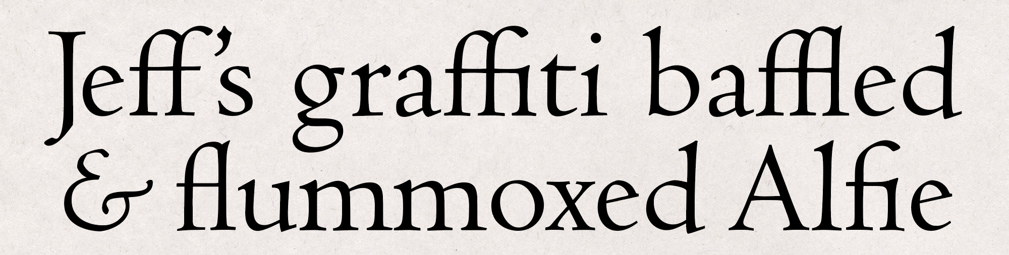
In this century another yoked couple has made a stealthy arrival and has become surprisingly common. The Th ligature now turns up in the web fonts used by, among many others, the Atlantic, McSweeney’s, LitHub, and restofworld. Over the past few of years I have come across it in more and more books, and I have a firmly divided opinion about it. When used in large sizes, as in the illustration below, or for titles and short strings of text, there is no reason for a designer not to use it if they see fit. In anything meant for continuous, sustained reading – in the body text of articles and books – it should always be avoided.

Adobe Jenson Pro Display

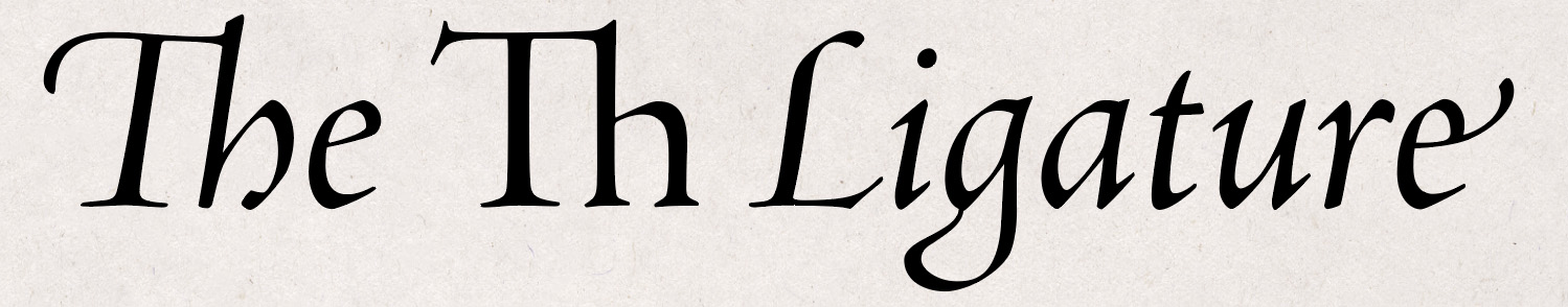
For the most part, it is an anglophone issue. An uppercase T followed by a lowercase h is a rare combination in most Latin scripts. It barely appears in romance languages, and isn’t much more common in most other lexicons. But in English it’s all over the place. The confounding multiplicity of Thomases in Hilary Mantel’s Wolf Hall; every Thursday; This and That, These and Those; and the word most frequently used to start a sentence in the language: The.

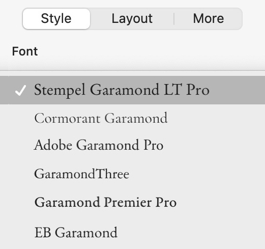
As a form isn’t necessarily a novelty; most commonly paired letters have been seen hitched in manuscript, inscription and print for centuries. But historically – in moveable type which was originated for the setting of text in Latin where the combination barely exists – it has been rare. What is definitely new is how some type designers are designating the glyph in digital fonts: not among the discretionary ligatures, where it surely belongs with the quaints, but with the standard ones. (There is no standard in the sense of a protocol agreed among type designers: each foundry decides for itself what’s discretionary and what’s standard.)

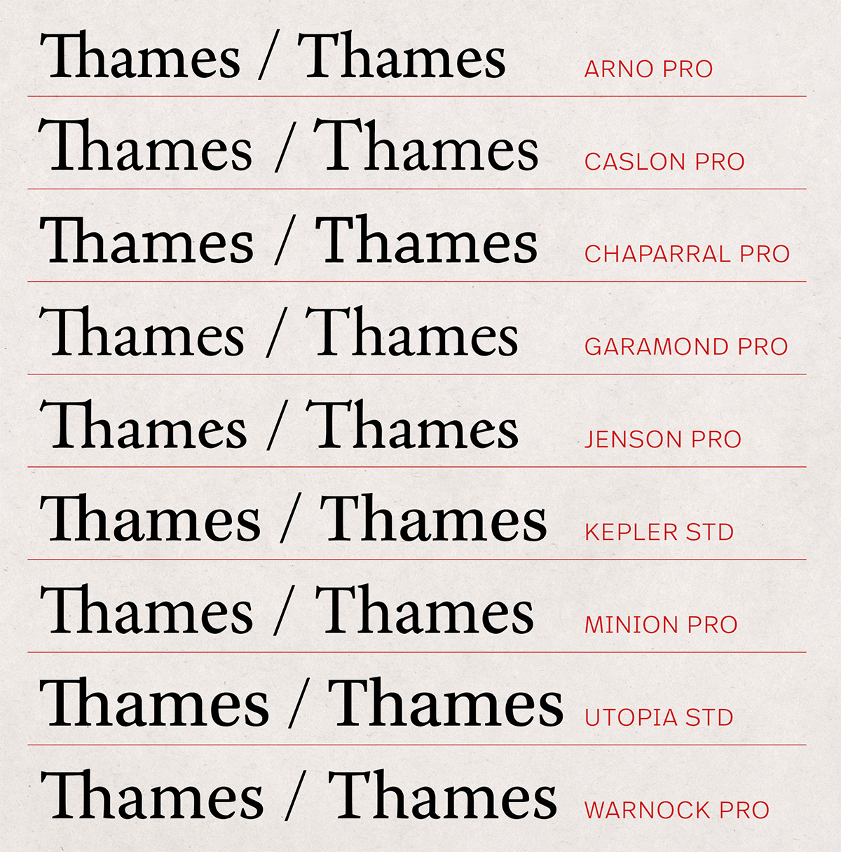
Typefaces which have been fitted with the Th lig as standard have been introduced by several designers and foundries over recent years, including Alegreya by Juan Pablo del Peral, Cormorant Garamond by Christian Thalmann, and GT Sectra from Grilli Type. But the momentum behind the glyph’s new pervasiveness certainly has one primary driver: Adobe Systems. It’s arguable that no company has had a greater influence on the development of digital typography than Adobe, creator of the PostScript page description language and the ubiquitous PDF. From the late 1980s the firm also started issuing its own type under the Adobe Originals brand. Among these are popular revivals of renaissance and enlightenment typefaces, including modern interpretations of type made by Nicolas Jenson, Claude Garamond and William Caslon. These, and several other Adobe faces, have now been retrofitted with the anachronistic Th lig. Even if one doesn’t like the thing, it’s easy to understand why these fonts are so widely used. They have extensive character sets including rarely used (but for some work essential) characters and diacritics. And if one signs up to any of Adobe’s graphics products – including InDesign, the most widely used page-layout program for professional publishing – as well as the app, the subscription includes access to these and thousands of other fonts as part of the deal, with no additional licensing costs.

Some of Adobe’s typefaces, with and without the Th ligature
Adobe Originals, with / without the Th ligature

Obviously some type designers are fond of the thing: no one asked for it, but there it is. Perhaps a few graphic designers and typographers find it delightful too, and wonder why it took so long for it to gain favour. But T and h in their distinct forms have sat next to one another harmoniously for centuries. The space between the letters isn’t an aberration to be eliminated: white space is integral to the design of words on pages – we don’t focus just on perfected letterforms, we read the paper and the ink together. Although it is possible, if more awkward than it ought to be, to omit the pairing without also losing the rest of the standard ligs, it seems to have been lazily accepted. Or perhaps it’s simply invisible to most people, and only cranks are vexed by it. I don’t have a particularly well-adapted eye for distinguishing one typeface from another, but whatever the font, the Th lig pulls my attention from the text to the form of the type every time it appears. It isn’t irritating in the way of a background-noise which after a while one can become accustomed to, it’s more like a smoke detector with a failing battery: a faint yet shrill chirp, inexorably chiming just as one has forgotten to expect it.
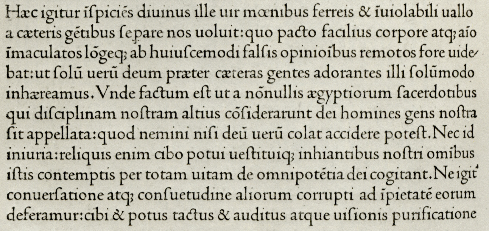
Images. The details from the 42-line Bible and De Evangelica Praeparatione are taken from Art of the Printed Book (Pierpont Morgan Library, 1973). Images included in this post may be used under the terms of the Creative Commons CC BY 4.0 license.

Between Plantin & Times

Cover of the ‘London Review of Books’ Volume 19 Number 1, 2 January 1997

As much was retained as was changed in the 1997 redesign of the London Review of Books. There were no editorial innovations: the table of contents remained undifferentiated, giving the same emphasis to contributions be they book reviews, essays or poems. The Caslon masthead stayed, as did the four-column layout, itself indebted to, if not precisely inherited from, the design of the New York Review of Books, which had been instrumental in the launch of the LRB in 1979. The page size was reduced a little, and some symmetrical discipline was imposed: articles were no longer allowed to end in a single column, forcing the next piece to begin over three columns of the same page. Poems were given more room to breathe, being set in airy boxes, rather than, as had sometimes happened, appearing to be fillers for short-running columns. The range of type, which had been a bold version of Plantin for headings and drop capitals, Times New Roman for body text, and a movable feast for the words on the covers, was slimmed down to a single face, Quadraat designed by Fred Smeijers.

Released in 1992, less than ten years into the era of digital type, Quadraat arrived in a less crowded marketplace than a new face does now. The exact number of digital typefaces is unknowable, but it’s certain that there are now well over 100,000 comprised of, by some estimates, more than a million fonts. But Quadraat was up against established players, familiar to designers and art directors who might not have seen the need for yet another book face. It has proved a success, valued for its many merits. It is compact (the italic exceptionally so) which is important for papers like the LRB where the four column grid makes a narrow measure. There are glyphs to set most European latin and cyrillic alphabet languages, and as well as all of the standard ligatures, some less common and more outré ones.

In addition to old-style and lining figures it includes a rarer small capitals lining set, useful, for example, when one wants a line of type to do double service, not just as words and figures, but also to separate one part of a page from another, to appear almost as a rule made of letters and numbers. In the issue date and price strap shown in the middle of the image below, lining figures would be much taller than the small caps, and the ascenders and descenders of old-style figures would variously rise above and fall below them.

In a piece for Print magazine in 2011 Paul Shaw included Quadraat in a list of ‘flawed typefaces’. He made it clear that by this he didn’t mean type that was bad, or even mediocre, defining a flawed typeface as one that a typographer might avoid because it features a questionable design decision. The inherent vice he identified in Quadraat was the leg of the roman R, which descends noticeably below the baseline. For newer releases, Quadraat can be struck from Shaw’s list. In Quadraat Pro, the version issued soon after his article was published, the default style is still the swooping one, but it includes a baseline-hugging alternative.

Quadraat might not ever become as prevalent as Bembo, Caslon or Garamond (and those of us who use it can’t deny that its relative exclusivity is among the traits we value it for) but it is clearly thriving. Before the LRB started using the face, it had already caught the eye of serious typographic people: in 1995 Ruari McLean chose it for the design of his anthology Typographers on Type: just the sort of encouraging endorsement a young typeface needs.

Spread from ‘Typographers on Type’ by Ruari McLean
A spread from ‘Typographers on Type’ designed and edited by Ruari McLean

And it’s not just for the snoots: Quadraat is gaining a lively presence outside literary journalism and the typographic smart set. I recently got a snap of it in the wild on a walk through my neighbourhood, where it was hawking pizzas.

Pizza Express umbrella

Fred Smeijers has said that he designed Quadraat to fill a gap in the typographic palette, one he saw as existing ‘somewhere between Plantin and Times’. Proportionally, it fits there: lighter than Plantin, heavier than Times. But structurally, it doesn’t owe much of a debt to either face. Jan Middendorp has described it as having ‘classical proportions but very contemporary and idiosyncratic details’. Robert Bringhurst wrote that ‘it is not pretty; its beauty is deeper and stranger than that.’ Erik Spiekermann agreed, noting that, in large sizes, it ‘looks as strange as the double “a” in its name’ but that it succeeds thanks to ‘little quirks to delight the tired eye.’

Is there a more pertinent term than ‘idiosyncratic’, ‘strange’ or ‘quirky’ to describe its visual quality? Maybe a differently imprecise one, found outside the alphabets which Quadraat encompasses, would be better : 侘寂 which translates as wabi-sabi. The Japanese term, a you-know-it-when-you-see-it conjunction of the austere (wabi) and the rustic (sabi), can nicely describe something that has been carefully made, but not polished until its surface no longer shows the marks of its making. I have been setting pages with Quadraat for more than a quarter of a century and I still like the feel of its rough edges.

 Notes. The original design of the London Review of Books was by my father Peter Campbell, working from a specification from the paper’s first editor Karl Miller. Peter was also responsible for the 1997 redesign which, with a few minor modifications, is the layout that the paper still uses; print and digital projects using Quadraat can be seen on Fonts in Use; Quadraat is available from TypeBy.  Sources. ‘Flawed Typefaces’ by Paul Shaw (Print, 12 May 2011); Dutch Type by Jan Middendorp (010 Publishers, 2004); The Elements of Typographic Style by Robert Bringhurst (Hartley & Marks, 2012); Stop Stealing Sheep by Erik Spiekermann (The Other Collection, 2022).  Images. Covers from the London Review of Books © LRB (London) Ltd; spread from Typographers on Type © Lund Humphries Publishers; other images included in this post may be used under the terms of the Creative Commons CC BY 4.0 license.

Stop Stealing Sheep

Erik Spiekermann

The Other Collection / 4th Edition / 2022 / 240 pp

‘Anyone who would letterspace lower case would steal sheep’, a bowdlerised version of a remark made by the type designer Frederic Goudy, inspires the book’s title. As in the three previous editions, themed chapters are made up of spreads each of which is a short, illustrated essay on an aspect of visual communication. The latest version includes more typefaces, and is brought up to date with an expanded discussion of type on screen, and a new chapter on variable fonts. Jargon is avoided where it can be, and gently explained where it can’t. The book would be valuable to any student of design (even in disciplines beyond graphic arts) and to experienced designers whose range doesn’t match that of Spiekermann’s practice – from small letterpress jobs, through books, magazines, type and product design, to corporate branding and city-wide public transit systems – which is to say, almost everyone in the business. Google Fonts have made the book available for free as a PDF, but it is essentially a handbook, and the print edition is its happiest manifestation.

The print edition of Stop Stealing Sheep is available from p98a Berlin. The PDF has been made available for download by Google Fonts.

Lead as in Dead

Like all trades, printing has generated jargon, which like water will find its way. Some terms which have dripped into the wider language have thrived with their new metaphorical meanings, while withering in the business they came from.

Two words expressive of banality have their origins in the printing office. Coined by the Parisian printer Firmin Didot, the original stéréotype was a printing plate made from a mould of previously prepared hand-set type. Cliché, onomatopoeically derived from the clicking sound made when it was hammered into the type, was the name of the engineered-paper mould. Both words promptly made their metaphorical way into French and – tout suite – were stripped of their diacritics absorbed into English.

In letterpress printing a sort is a single piece of cast-metal type: say, a letter, a figure, or a punctuation mark. A compositor who was out of sorts had exhausted the supply of one or more characters needed to set a text. In hot metal setting, sorts were replaced by slugs – lines of metal type formed in the matrices of line-casting machines. After printing, the slugs could be recycled: thrown into the hellbox and melted down to be cast anew. With photo­composition and digital type, the sort and the slug were superseded by the disembodied and infinitely reproducible glyph. The only reason to be out of glyphs is by intention, a test Georges Perec set for himself in his novel La disparition, where the notional type-case was devoid of the letter ‘e’.

Something else that certain typographers would like to see thrown into the hellbox of history is leading. In a marginal note to his essay in Aspects of Contemporary Book Design the graphic designer Andrew Barker called for its retirement:

Oh please, not ‘leading’! Leading is only possible with metal type, and not only that, the term is misapplied in computer programs. Properly 10.5 pt leading is 10.5 in addition to the body size. So no, I won’t be using the term ‘leading’ unless I find myself talking about metal type. When working on a computer I shall refer to the baseline–baseline distance, a term that may be cumbersome, but it is at least unambiguous and accurate.

Barker’s hope of sidelining the anachronism has proved largely futile so far. Perhaps leading will go the way of stereotypes, clichés, sorts, slugs and hellboxes, but the archaic term, even if inexact, is still the most elegant available (as well as ‘baseline–baseline distance’ other clunkers one sees from time to time are ‘interlinear spacing’ and ‘linear increment’). The 10.5 pt example is technically correct, but for such a misunderstanding to be carried through to a job would require abject cluelessness.

In another tussle over leading, between editors and compositors, the printers came out on top. The printers’ lead (rhyming with dead) refers to strips of metal inserted between lines of type to space them vertically, the editors’ lead (rhyming with bead) to the opening paragraph of an article. In newspaper composing rooms where editors and compositors worked on the same copy in close quarters, the ambiguity had to be quashed. It was happily resolved: the printers got to keep their metal, and even post-line-casting, journalists use the slangier lede.

A word which, in one of its uses, is hanging on by the skin of its teeth is roman. This was often used to denote the most common, upright version of an old-style (generally speaking, serifed) typeface, and sometimes still does. In Linotype’s Janson and some of Matthew Carter’s designs, including Galliard and Miller Text, the weights intended for body text are called roman. Most digital typefaces now label such fonts either regular or normal. For one ubiquitous typeface this has prevented a troublesome tautology.

Italic is on firmer ground, even though if you think about it too much, the word’s derivation makes it rather vague. Its meaning, ‘of or pertaining to Italy’, could equally apply to roman type. A better designation might have been Venetian, for the city where Aldus Manutius commissioned Francesco Griffo to cut the earliest version of such type. But Venetian Old Style, also known as Humanist, has subsequently become one of the terms used to distinguish the roman fonts made before 1495 from later Garalde type, itself sometimes called French Old Face. To add to the confusion, some of the most admired and imitated Venetian Old Style type was created by Nicolas Jenson, a Frenchman. Let’s just lean into italic.

Virgil: ‘Opera’ (Aldus Manutius, Venice, 1501)

The approach H.W. Fowler prescribed for the use of italics, to ‘pull up the reader & tell him not to read heedlessly on’ seems to be declining a little. The New Yorker used to italicise titles, but now puts them in double quotation marks, reserving the style for emphasis and non-English words and phrases. The Guardian considers title case alone sufficient to distinguish the names of books, newspapers, plays and movies, although its sister Sunday title, the Observer, still prefers italics. The two newspapers share an online presence – theguardian.com – where the typography, identical for both titles, makes it easy to mistake which paper originally published an article. Below are the opening paragraphs of reviews of the same movie, by Peter Bradshaw in the Guardian, and by Mark Kermode in the Observer. The writers share a couple of exact comparisons and are in five-star critical consensus. The rival subeditors haven’t found as much common ground.

Guardian / Observer comparison
notes. Gilbert Adair won the Scott Moncrieff Prize for his lipogrammatic English translation of Perec’s La disparition, and deserved it for his insuperable punning title alone: A Void.  images. The spread from the Aldus Virgil comes from Art of the Printed Book (Pierpont Morgan Library, 1973).  sources. Aspects of Contemporary Book Design, edited by Richard Handel (University of Iowa Press, 2013); A Dictionary Of Modern English Usage by H.W. Fowler (Clarendon Press, 1926); the reviews of Past Lives were published in the Guardian on 6 September 2023 and in the Observer on 10 September 2023.

Signs of Deep Time

Prefixed with the nationality of the word’s origin, Döstädning is known in English by its blunt translation as ‘Swedish Death Cleaning’. This is the practice of dealing with the material detritus of our lives while we still can. Upon entering, say, our eighth decade, we should start emptying attics, closets and basements of clutter. It is an act of anticipatory kindness to our future grieving heirs who will have enough to cope with besides our accumulations of junk. Some people have been thinking about a sort of inverted version of this for an even higher purpose: the preservation of the human race. If civilisation were wiped out by human folly or natural disaster, how could we warn our post-apocalyptic successors, for their own good, not to go rooting through the worst of the stuff we have left behind? Nuclear and biologically hazardous waste is piling up, and in the absence of reliable methods of making it safe, the means employed to keep it siloed are dependent on stewardship that would be gone.

As well as the challenge of making long-term warnings so resilient that they can see out whatever world-shattering event had taken place, and the indeterminable length of time that new communities might take to emerge, there is the matter of what our human successors would have in common with us. Some language might be assumed, but whether it would be anything like existing ones isn’t certain, and the written word might not have survived at all.

Biohazard symbol; nuclear trefoil, skull and crossbones

Could any sort of persistent sign or pictogram be an answer? The general consensus has been probably not. Without written language or the context of familiar objects these would lack any meaning. The biohazard sign and the nuclear trefoil are pure abstractions without any intrinsic symbolic value. The skull and crossbones seems like a candidate to inspire terror, but tales of ferocious seagoing pirates would have perished with us, and bare bones alone can’t be counted on to be universally terrifying. Skulls and skeletons are common mottifs in art and design, tattoos, jewellery and textiles, and by no means always as symbols of threat. In Mexico calaveras, long a traditional part of folk art and the celebrations of the Day of the Dead, can seem almost as festive Santa Claus.

‘Calaveras Zalameras de las Coquetas Meseras’ by J.G. Posada
‘Calaveras Zalameras de las Coquetas Meseras’ (‘Saucy Calaveras of the Flirty Waitresses’) by J.G. Posada

In the early 1980s the US Department of Energy and the Bechtel Corporation formed the Human Interference Task Force, a multi-disciplinary team of academics and experts, assigned to come up with methods for leaving comprehensible messages that deep time won’t erase. Unlike ordinary shibboleths, signs identifying or understood only by certain groups, these should express pan-human symbolism, be understood by everyone.

A group led by the architect Michael Brill suggested assembling ‘Deterrent Landscapes’ around waste dumps: rebarbative formations designed to look threatening and be difficult to negotiate on foot. A problem with this is that most of the likelier disasters that might have all but wiped us out will have made every landscape look pretty deterrent.

A more adorable, if technically more challenging, proposal came from the philosophers Françoise Bastide and Paolo Fabbri: ray cats, short for radiation cats. A quality rare in nature possessed by domestic cat is that they are not exactly parasitic or symbiotic, but self-domesticating. Cats have proved themselves skilled at ingratiating themselves to human communities where they are not just tolerated, but appreciated for their minor efforts at pest control, and more so for their companionable nature and appealing looks. If felis catus could be genetically modified to change colour, or perhaps even glow, in the presence of radiation, our descendants might learn that this was a prompt to grab the moggy and get the hell out of Dodge.

A ray cat
I think we should go now.

Our history of collapsed civilisations suggests that humans might not be good at very long-term planning, and it seems unlikely that any of the HITF’s schemes will be put in place. Should the worst happen, the next humans may have to learn from hard experience that invisible poisons abound in some places, and these places should be avoided. But one thing our species is good at is improvising, so perhaps warning signs do have a future, even if they will have to wait for the people of the after-times to make them. Homo Anthropoceno would probably use strategies similar to those we use now.

One way of sending a wordless message is to simply put something in a counter-intuitive position or place. These gestures aren’t always immediately obvious and sometimes need to be gently explained. In my own domestic arrangements I have been taught that a balled-up Post-It note in the hallway hasn’t necessarily been dropped by mishap, but is as likely to be an aide memoire left by my partner, reminding herself not to leave home without picking up a particular thing before she goes. For the United States armed forces, flying the stars and stripes upside down has been a way of silently communicating extreme distress (a pattern which has been co-opted in political protests).

Other configurations don’t really need to be learned, and are clear so long as one has some familiarity with the artefacts of the place where they are seen. In a British pub, a towelling bar mat covering a counter tap makes it obvious that the ale from that pump is out of stock. The raised hood of a vehicle beside the road tells us that it has broken down. This could have been a problem in London when old Routemaster double-deckers conked out: their engines are at the front, so the hood is unseeable from the rear. The improvised, universally understood solution was to lean the top of a bench seat against the back of the bus, letting anyone approaching from behind know it wasn’t going anywhere any time soon.

One of these symbolic solecisms which I’ve only come across in the past few years, is seen after closing time in the windows of some cafés and small shops.

Cash drawer tray

The written version of this is often inscribed on the trucks and vans of builders, plumbers and carpenters – No tools or valuables will be left in this vehicle overnight. The empty cash tray, a metaphorical turning out of the pockets, does the same job by literally showing potential smash-and-grab artists that, whatever else might be behind the plate glass, there’s no money to be had. Sometimes the till drawer’s sole purpose is to make this statement: a coffee shop close to where I work, which routinely has one in the window, no longer accepts cash for a croissant, an espresso or a latte. If you only have notes and coins there’s just one way to spend them there: the tip jar.

 Images. Any images included in this post may be used under the terms of the Creative Commons CC BY 4.0 license. Notes. A short documentary on the ray cat solution can be seen at theraycatsolution.com

Mod Adjacent

Scooters, Trafalgar Street, Brighton

On certain bank holiday weekends the seaside soundscape of Brighton – surf-on-shingle, raucous herring gulls – is augmented by the rackety putt-putt of two-stroke engines. The city remains one of the prime rallying destinations of mods, and they have been rolling into town on their scooters for well over half a century. Once, their arrival, along with their subcultural nemeses, the rockers, would have been dreaded. Some locals fretted that the violent, amphetamine-fuelled melees on the seafront – in which the rivals whaled on one another with deckchairs and any other makeshift weaponry which came to hand – harmed the town’s standing as a place for innocent fun and healthful leisure. Proclaiming this sort of wholesomeness betrays a dubious civic self-image. Free associate on the town’s name and ‘dirty weekend’ won’t take long to come up, and complaints about intemperance date back to at least 1805 when Eleanor Creevey wrote to her husband Thomas about visiting the Prince Regent at the Royal Pavilion:

Oh, this wicked Pavilion! We were there till half past one this morning, and it has kept me in bed with the headache till 12 today. The invitation did not come to us till 9 o’clock: we went in Lord Thurlow’s carriage, and were in fear of being too late; but the Prince did not come out of the dining-room till 11 […] When the Prince appeared, I instantly saw he had got more wine than usual, and it was still more evident that the German Baron was extremely drunk.

The Royal Pavilion, Brighton

Queen Victoria never liked the place (she was the last royal owner of the Pavilion and got shot of it in 1850) or its people (‘very indiscreet and troublesome’). The town’s reputation wasn’t much better in the early part of the 20th century. Precisely confirming Victoria’s assessment of the populace, in 1902 Rudyard Kipling gave up his house in nearby Rottingdean after a skeevy Brighton coach operator started offering day-trippers rides to catch glimpses of the great man in his garden from the top of a horse-drawn double-decker. Patrick Hamilton’s The West Pier and Graham Greene’s Brighton Rock both dwelt on the place’s abundant seedy aspects. It seems likely that it was a condition of the town’s council that, for allowing location shooting for the 1948 film of Greene’s book, the producers should include this disclaimer after the title sequence:

Brighton today is a large, jolly, friendly seaside town in Sussex, exactly one hour’s journey from London. But in the years between the two wars, behind the Regency terraces and crowded beaches there was another Brighton of dark alleyways and festering slums. From here, the poison of crime and violence and gang warfare began to spread, until the challenge was taken up by the Police. This is a story of that other Brighton – now happily no more.

Unfortunate commuters would take issue with ‘exactly one hour’ and that ‘happily no more’ proved unwarrantedly hopeful. Within a few years the police had to rise to the challenge again. One of the bigger scuffles between mods and rockers occurred in Brighton during the spring bank holiday of 1964, and this became the setting for a central sequence in Quadrophenia (1979), the film roughly derived from The Who’s album of the same name. The release of the movie coincided with probably the largest of the mod movement’s serial revivals and it became a touchstone for the new mod generation. A very specific site of pilgrimage is the alley where Jimmy (Phil Daniels) and Steph (Leslie Ash) have a hectic upright coupling after retreating from the seafront battle. The alley has been informally rebranded, and gives its name to a long-standing mod outfitters on its north side.

Quadrophenia Alley street sign
Quadrophenia Alley, Brighton

Elsewhere in Brighton the mod economy thrives too. Local clubs capitalise on the bank holiday weekenders, and Quadrophenia Alley is just one of a number of boutiques selling The Look.

Club night ads, Brighton, August Bank Holiday 2023
The Modfather, Brighton
XLNT BRTN
Jump the Gun, Brighton

An indication that mod is a subculture defined by a particular slice of modernism, which now amounts to nostalgia, is evident in the shop shown below. Not explicitly part of the scene, the store specialises in mid-century homewares, it acknowledges an allegiance that is – at least – mod-adjacent, being marked with one of the tribe’s shibboleths, the RAF roundel.

Mid-century Vintage

The old enemy has faded away, or at least, their designation has. One still sees the rocker uniform occasionally – Brylcreemed quiff, leathers, denim, pudding-basin helmet – but almost everyone would now call these hold-outs bikers. On bank holiday weekends the only two-wheeled tribe rivalling the mods is the local chapter of the biggest bike brigade in the world, the food delivery riders.

Without an active foe, the mods have become entirely peaceable and residents no longer worry when they ride mob-handed into town. These days the neighbourhood threat comes from two other fearsome out-of-town gangs: the hens and the stags.

Bride to Be sash

Sources. The excerpt from Eleanor Creevey’s letter is taken from Chapter III of The Creevey Papers.  Images. Any images included in this post may be used under the terms of the Creative Commons CC BY 4.0 license.

Art of Attrition

Most cities, in their edgelands or less invigilated central areas, are now home to streets where almost every vertical surface is either, depending upon one’s outlook, adorned with street art or marred by vandalism. One such, in Brighton, is Trafalgar Lane, an alley just to the south-east of the train station’s undercroft. Along its 100 metre length are the backyard walls of a terraced street on the east side, and a builders’ merchant stretching along most of the west. Here the aerosol, if not explicitly sanctioned, is largely tolerated. Even some local residents and business owners who consider graffiti to be unsightly will grant that, having become a minor tourist attraction, the footfall has reduced the street drinking and drug dealing that used to be endemic there.

Grafalgar Lane (as it has, with some inevitability, been rebadged) provides the painters with various substrates. The builders’ merchant side is brick interrupted by large steel roller shutters, the residential side, mainly stucco. The pub on the north-west corner and some adjacent workshops have decided not to play, and have applied dungeon grey anti-graffiti paint to their walls.

A new dawn, a new day
Biggie and Tupac
Brighton graffiti
Brighton graffiti

Most pieces don’t last long here. A site-specific exception for the last four or five years has been the witty use of foliage above Sideshow Bob’s head, shown here as it was not long after it first went up, and as it is now, radicalised after the murder of George Floyd (between these versions, during pandemic lockdown, Bob briefly exhorted passersby to STAY HOME!).

Sideshow Bob graffiti

A few years ago when one of the terraced houses was remodelled, among the improvements was giving the back wall a re-render, a smart white paint job, and a hopeful NO GRAFFITI sign. The surface didn’t remain unmolested for long. The sign’s NO, in the feeblest of rebel gestures, was promptly crossed through, and tags and throw-ups began to appear. The fight for gentility seems lost and the wall, for now, has become another panel in the gallery. There used to be a more tenacious hold-out: the tenant of a parking garage who made an evolving piece of anti-art that was, notwithstanding the accomplishment of some of the work that goes up there, the best in the lane. The steel doors of the lock-up, continually assaulted despite the stencilled prohibition, changed from week to week, its gauzy texture formed by regular and zealous scraping and sanding.

parking garage

In the realm of fine art, this sort of erasure has a respectable pedigree (at least when the erasing is done by the creator of the original image): Gerhard Richter’s ‘Cage’ series (2006) was made using a similar if less thorough process. Unlike paint on canvas, ephemerality is the fate of paint – or lack of it – on walls, and when the owner gave up the garage it wasn’t long before a less distinctive manifestation appeared…

And was itself eclipsed by one less distinctive still…

 Images. Any images included in this post may be used under the terms of the Creative Commons CC BY 4.0 license.

Filed under : Art

Zombie Signs

Alice Rawsthorn’s series of pictures of more than century-spanning ghost signs, posted on Instagram this week, prompts me to unearth a more contemp­o­rary and prosaic selection of my own. Unlike most of Rawsthorn’s, these are too recent to have accrued any antique charm and are not destined to haunt for long : less ghosts than zombies, awaiting erasure by sandblaster, or staggering towards final resting places in builders’ skips.

Pitstop, Berlin, 2022
Las Vegas, Leeds, 2011
Panasonic ghost sign, Brighton
Esprit ghost sign, Brighton

 Images. Any images included in this post may be used under the terms of the Creative Commons CC BY 4.0 license.

Kubrick Sans

Now secure with the status of a classic, Stanley Kubrick’s Barry Lyndon (1975) wasn’t universally admired when it was first released. Pauline Kael described the adaptation of William Makepeace Thackarey’s novel as ‘a mistake’. In her review for the New Yorker she wrote : ‘It’s a coffee table movie; we might as well be at a three-hour slideshow for art-history majors.’ Michael Wood, writing in the New York Review of Books, agreed that it was pretty but dreary : ‘there is only the slow parade of flawless pictures, and the dance winds down to a death march, sumptuous last honors for what used to be the movies.’ In another passage of his review, Wood wrote :

‘How did they ever make a film of Lolita?’ the advertising asked when the movie was first released – although the question was not prompted by the texture of Nabokov’s prose. One critic tartly replied, ‘They didn’t.’

This gets to something about Kubrick. Once he gained independence from the studios (which nevertheless continued to fund his work for the prestige it brought), his movies, each developed over years, were faithful to their sources only so far as they suited his intention. Sometimes to the irritation of their authors : Stephen King said of Kubrick’s 1980 film of The Shining that it was ‘a big, beautiful Cadillac with no engine inside it.’ In Barry Lyndon there’s another disconnect between source and movie : much of the preparation that went into making it, including the assembly of a huge archive of books, images and artefacts, was undertaken for another project altogether, an eventually aban­doned life of Napoleon. Perhaps preparing to make one project, a bio­graph­ical epic, then filming another, a picaresque, set in much the same historical context, grafted an austere and laconic mood to something that would have benefited from being lighter and wittier.

But even if one agrees that it is a mere slideshow (I don’t), it’s a spectacularly conceived one. No contemporary sets were built, all the filming being done on location in Ireland, England and West Germany (often in stately homes where the production crew had to work around guided tours of the properties taking place at the same time). The attention to detail went beyond archi­tecture, costumes and props : Kubrick also wanted 18th-cent­ury light. The film was photographed by John Alcott, in daylight whenever possible. The night-time interiors were candle-lit, shot without using any artificial lighting. For these scenes Kubrick got hold of the lens best-suited to filming in pro­foundly gloomy conditions – the Carl Zeiss Planar 50mm f/0.7 – developed for NASA’s Apollo Pro­gram to photo­graph the dark side of the Moon. Only ten were made : NASA bought six, Kubrick three, and Carl Zeiss AG kept one. The lenses, which had been designed for still image photo­graphy, had to be radically modi­fied to work for motion filming. Even with state-of-the-art optics, triple-wicked candles had to be made to throw out enough light, and actors’ pos­ition­ing and movement were highly circ­um­scribed to avoid them dropping out of focus.

Kubrick’s 18th century is coherent and plausible. The landscapes are muddy rather than manicured; the costumes look lumpy and hand-stitched compared to the sleek machine-made tailoring that appears in most period dramas, and the compositions, some echoing paintings and prints contemporaneous to the setting of the story, are as Wood said, flawless. Well, almost. This 18th century isn’t a perfect replica : the IMDB entry for the movie lists numerous ana­chron­isms, but in a period piece running to more than three hours, a few slips are hardly surprising. One that has so far evaded attention on IMDB comes in the scene in which Barry arrives at an inn where he is to be recruited to the British cause in the Seven Years’ War. The text of the sign at the Health to the Barley Mow is rendered in a condensed semi-bold sans serif font with a distinct whiff of the machine age : type the like of which wouldn’t be seen until more than a century after the setting of the movie.

From ‘Barry Lyndon’ (1975) copyright © Warner Bros.

Given Kubrick’s meticulous research, budget, and acquisition of actual space-age tech­no­logy, this does seem like a notable and avoidable gaffe. But in the mid-1970s when fonts weren’t part of most people’s workaday experience, and the history of type and printing a more-rarefied field than now, few would have noticed the anachronism. And some of us who do see it are the very people who remain oblivious, as the IMDB goof page tells us, to ‘two of the Prussian soldiers … firing U.S. M1874 Trapdoor Springfield rifles, disguised as flintlocks.’

Coined for the eponymous protagonist of Eminem’s 2000 song, a Stan is a fan whose loyalty to their object of admiration tends to the obsessive, and in the realm of movie fandom, there are few Stans to match Stanley’s Stans. The 2013 documentary Room 237 introduces us to some of them, investigating their theories about the meanings to be found in Kubrick’s version of The Shining. The inter­pret­a­tions run from the more-or-less unexceptional observation that there was something going on in the movie about the appropriation of Native American lands, to the endearingly far-fetched idea that the film was Kubrick’s oblique apology to his wife for not letting on to her that he had faked the footage of the 1969 Moon landing (the contributor makes clear that it was the footage that was faked, not necessarily the landing). Not mentioned in the documentary, pro­pon­ents of this theory would certainly see cosy lens-tech sharing with NASA as a smoking gun.

A few years ago, in a twitter exchange about Barry Lyndon, I light-heartedly (I know) posted the image above saying ‘Ruined it for me.’ A stern reply told me that sans serif types did indeed exist in the eighteenth century (I know they did) and such a hand-painted sign might well have existed (vanishingly improbable). I don’t know whether I was dealing with a defensive Stan-Stan or a compelled-to-educate typomaniacal-Stan, but had I, like Kubrick and his researchers, im­mersed myself in the graphic arts of 18th-century Europe, I might have had the smug satis­fac­tion of posting a detail from William Hogarth’s ‘Beer Street’.

‘Beer Street’ and ‘Gin Lane’

The companion to the more sensational ‘Gin Lane’, I don’t recall the picture being used in the run-up to the UK’s Brexit refer­endum, but it might easily have been, either by Leavers (without irony) or Remainers (with). The antipode to the degraded lives in Gin Lane (where, apart from the distillers, only the pawn­broker Gripe thrives), is the ad absurdum spectacle of prosperity and plenty in Beer Street (where the golden balls of Gripe’s counterpart, Pinch, path­etic­ally droop). Among Beer Street’s denizens, the only ragged figure is an inter­lop­ing artist (a visitor from Gin Lane?) lovingly adding an image of a gin still to a panel below an ale-house sign. I had never looked at the sign carefully until recently, but with esprit de l’escalier, I think it is fair to say that the Health to the Barley Mow is reflexively familiar. And has serifs.

Detail from ‘Beer Street’ by William Hogarth (1751).

Sources. ‘Kubrick’s Gilded Age’ by Pauline Kael (New Yorker, 29 December 1975); ‘No, but I read the book’ by Michael Wood (New York Review of Books, 5 February 1976); ‘Photographing Stanley Kubrick’s Barry Lyndon (American Cinematographer, 16 March 2018); Barry Lyndon ‘Goofs’ at IMDB; high-resolution versions of ‘Beer Street’ and ‘Gin Lane’ can be found on Wikipedia.  Images. With the exception of those including a copyright attribution in their captions, any images included in this post may be used under the terms of the Creative Commons CC BY 4.0 license.

Optimal?

The championing and despising of typefaces, once a form of attitudin­is­ing mostly con­fined to printers, designers and typographers, has been demo­crat­ised by the font menus on our com­puters. After decades of being a mark of respect­able authority Times New Roman, made too familiar by being among the earliest digital typefaces, is now widely derided as stuffy and overdue retirement. Helvetica is practically a fetish object for some who admire its austere neut­rality, the very qualities for which it is dismissed as bland by others. Another divider of opinion is Comic Sans. It is often mocked, but beloved by many, and now has name recognition to rival Helvetica and Times (and the mockery is usually unfair, to do not with the type itself, but its use in wildly inappropriate contexts). Many of us will use different fonts in different sorts of work, but some people find a typeface that suits them so well that they see no reason to ever use another.

Among the accusations of bullying levelled at the producer Scott Rudin by former employees and business associates, which prompted him to step back from various theatre, TV and movie projects last year, was that he would become furious when memos crossed his desk which were not printed in Garamond. Petulance made sillier if one considers that as an expression of sophistication, demanding Garamond is like insisting on ‘French wine’ : which one?

The name is now applied to dozens of revivals of French Renaissance typefaces, many of which have little to do with Claude Garamond (c.1500–1561). Some are based on type cut by his contemp­or­ary Robert Granjon, others on the work of Jean Jannon made more than fifty years after Garamond’s death, and others still that have been devised more recently for advertising and display purposes. Most of us would struggle to differentiate one from another, so perhaps Rudin would have accepted any of them. But even for those of us who care (perhaps too much) about the look of words on pages, reacting to a document having been typed in anonymous Helvetica or boring Times by throwing a tantrum (or worse, as variously alleged for similar infractions: a glass bowl, a phone, a serving of chicken salad) exceeds any reasonable definition of a demanding boss.

John Updike, who had studied drawing and typography at college, took a closer interest in the way his books were produced than most authors. He designed the covers of several of them and supplied detailed layout sketches for others. Included in Chip Kidd: Book One, the first catalogue of the designer’s work, is an illustration of Kidd’s proposal for the jacket of The Afterlife and Other Stories, embellished with Updike’s critique spread over a dozen Post-It notes. But despite this, and waspish notes to his editor (‘no Kiddian theatrics, please’) he clearly admired Kidd’s work: he wrote the introduction to Book One. Updike’s covers were often, though not exclusively, set in Albertus, but for the text Janson, based on type made by Miklós Kis in the late 17th century, was always preferred. Being required to use a particular typeface can be a dis­ap­point­ment to a typographer: decisions make designs, so removing choice from such a key element can rankle for those who want to put their stamp on a job. Some­times there will be a subtle rebellion. Although the text of Updike’s last, post­humously-pub­lish­ed collection, My Father’s Tears & Other Stories is set in Janson, the stories’ titles are in Perpetua and the running heads and folios in Electra. Three typefaces to set a text which would have worked perfectly well with two, and arguably even better with just one, seems like overkill. For designers less eager to make their mark it might have been a relief that preordained Janson is such a versatile and legible face.

Hermann Zapf (1918-2015) based his design for Optima on text he saw on a funerary slab at the Basilica di Santa Croce on a visit to Florence in 1950, making sketches of some of the letterforms on the only paper he had with him, a couple of 1000 lira banknotes. Lucky for him that he had some paper handy, and fortu­i­tous for those who would market the type that he supplied a good origin story. There are a number of versions (and unauthorised clones) of Optima, and Zapf himself continued to update the typeface as new technologies emerged and to refine it where he saw improvements could be made. The printing historian Frank Romano remembers, on first meeting the designer, asking him what it was that he did, to which Zapf replied ‘I correct the errors of my youth.’

Optima is a commercial and popular success – it has been used in the branding of a long list of firms including Amblin Entertainment, Aston Martin, British Airways, Estée Lauder, and Marks & Spencer – but for some its blending of the aesthetics of serif and sans-serif type denote a lack of conviction. Erik Spiekermann, reacting to its adaptation for use by Yahoo! in one of that company’s serial rebrandings tweeted: ‘neither sans nor serif. Like a man with little self-confidence who wears both a belt & braces.’

In a 2008 blog post about the typography of the US presidential race of that year, Jonathan Hoefler declared himself mystified by its use in John McCain’s cam­paign material, describing it as ‘the font of choice for the hygiene aisle’. A valid observation (see above), but it’s worth pointing out that it had been used in at least one earlier political campaign, albeit fictional (see below) and, as Hoefler acknow­ledged, he had skin in the game: Barack Obama’s campaign that year used Tobias Frere-Jones’s Gotham, published by Hoefler&Co.

‘Taxi Driver’ © Columbia Pictures, 1976.

I have a grumble of my own about Optima. British book design for trade fiction and non-fiction since the middle of the last century, much influ­enced by Jan Tschichold’s tenure as head of design at Penguin Books from 1947 to 1949, has largely been a formally conservative business. The designer Ron Costley’s re­mark that his American counter­parts were on a ‘relentless quest for a new place to put the folio’ is indicative of how British typo­graphers tend to the un­ob­tru­sive, and it is books de­signed by them that I grew up reading and have grown used to. The layouts of Rachel Cusk’s trilogy of novels Outline, Transit and Kudos, and of her sub­sequent books, in most respects follow this modest British model, except for the choice of Optima for the text. My atavistic ex­pect­ation that the text would be set in a Garamond, a Caslon, or even a tired old Times, meant that each time I opened one of the books, rather than being drawn in, I felt slightly rebuffed. Although after a page or two of reading my mind and eye would adjust to the text, right to the end of the trilogy, picking up the books anew caused the same slight dissonance.

But context is important and Optima still has much to be said for it. Having come full-circle, it can now be seen doing what the original that inspired it was made for, in the restrained, sombre text of monumental inscriptions. As well as on public art like the plaque shown below, letter­forms from a Florentine tomb now inscribe the names of the American dead on the Vietnam Veterans Mem­or­ial in Washington DC, and the victims of the World Trade Center attacks at the Sept­ember 11 Memorial in New York.

Riverwalk, San Antonio, Texas.

Notes. I don’t know of a more compelling defence of Vincent Connare’s Comic Sans than Mike Lacher’s channelling of the font at McSweeney’s. Sources. Michael Paulson & Cara Buckley on Scott Rudin (New York Times, 24 January 2021); Rachel Berger on John Updike’s book covers (AIGA Eye on Design, 9 August 2022); Chip Kidd: Book One (Rizzoli, 2005); Frank Romano: Phototypesetting and the Second Revolution in Type (Type@Cooper’s Herb Lubalin Lecture Series via YouTube); Jonathan Hoefler on the fonts of the 2008 presidential campaigns (typography.com, 22 February 2008).  Images. With the exception of those including a copyright attribution in their captions, any images included in this post may be used under the terms of the Creative Commons CC BY 4.0 license.