The technical contract rider Van Halen presented to venues where they were performing in the 1980s ran to many pages. Most of it concerned how to manage construction, safety and security of the huge stage, lighting and sound rigs for their shows (in his autobiography Van Halen’s lead singer David Lee Roth described the truck-loads of equipment as weighing ‘the business end of a 747.’) Buried within the contract was a MUNCHIES section specifying the required backstage snacks. It included, among the potato chips, pretzels and candy, the demand:
M&Ms (WARNING: ABSOLUTELY NO BROWN ONES)
At first sight, a bit of capricious rock ’n’ roll nonsense, but in fact a smart way to see if the contract – which included measures to preserve life and limb, of not only the band, but also the stage crew and audience – had been carefully read. A quick rifle through the M&M bowl would give a good indication as to whether the whole set had to be checked.
These remnants – typographic brown M&Ms – are sometimes included in more recent OpenType releases (which often have ‘Pro’ appended to the typefaces’ names) and are what to look for if one thinks they matter, or want to be sure there aren’t other problems lurking within the font (limited character sets, lack of standard ligatures and small capitals, erratic metrics and so on). This wouldn’t necessarily be apparent from looking at the samples that online sellers publish, which are, of course, fashioned to show the type to its greatest advantage. The first four examples in the table below are from versions now available in Monotype’s library. Glyphs from Times New Roman, shown in pink, show how that ubiquitous typeface has infiltrated others.
Typefaces shown: Times New Roman, Bembo MT Pro, Van Dijck MT Pro, Photina MT Pro, Meta Serif, Quadraat Pro, Adobe Garamond Premier, Adobe Jenson Pro.
@ is usually formed by the single-storey a (normally the lowercase italic, sometimes adapted to be less oblique) with a tail looping around itself. In Meta Serif and Quadraat the a parts of the glyphs have been elegantly simplified.
® the registered trademark symbol is also an encircled adaptation. Bembo and Quadraat both have alternate versions of the letter R. In Quadraat, the less emphatic one (without the leg dipping below the baseline) is used for the symbol. The version of Bembo here has the Times one.
™ the unregistered trademark symbol. The sizing and alignment of this and ® differ according to foundries’ styles. Adobe’s match the rest of the font, but are much-reduced in size compared to other glyphs, so although nicely proportioned, they might be practically illegible when set in small sizes.
¶ the pilcrow. Even if one might rarely use it, is a nice opportunity to demonstrate something of the style or historical period a typeface is referring to. Meta Serif’s machine-age hint of a super-ellipse and Jenson’s renaissance form are particularly good.
€ came along in 1999 and it is essential to almost all Latin fonts released or updated since then. The top and bottom finials of the € generally echo those of the capital C. Appropriate glyphs have been retrofitted to Photina and Van Dijck, but Bembo’s is taken directly from Times.
¶Sources. There is more information about Van Halen’s technical contract rider in this Snopes fact check. ¶Images. Any images included in this post may be used under the terms of the Creative Commons CC BY 4.0 license.
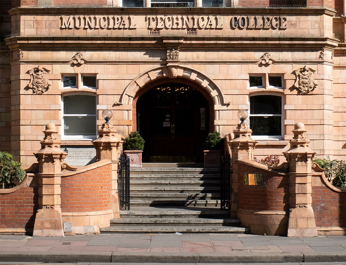
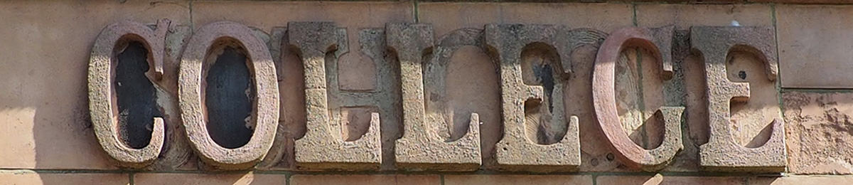
The former Municipal Technical College in Brighton rates a short entry in The Buildings of England(Sussex: East) but the only qualitative assessment of it, later in the book, is as ‘an overbearing neighbour’ to a better building next door. The terracotta text above the main entrance is good though, and I was curious about the third word, which looked much grubbier than the others. A closer look revealed that it had originally not been a COLLEGE, but a SCHOOL. At some point it must have been decided that this was beneath the dignity of the organisation or its students. SCHOOL was hacked off, and an inferior casting of COLLEGE was cemented in its place.
A tidier solution might have been to box the inscription behind a painted sign, but I like the scruffy palimpsest, and the story it tells of institutional nit-picking. The building was converted into apartments in 2004 so it’s unlikely there will be any more meddling.
¶Images. Any images included in this post may be used under the terms of the Creative Commons CC BY 4.0 license.
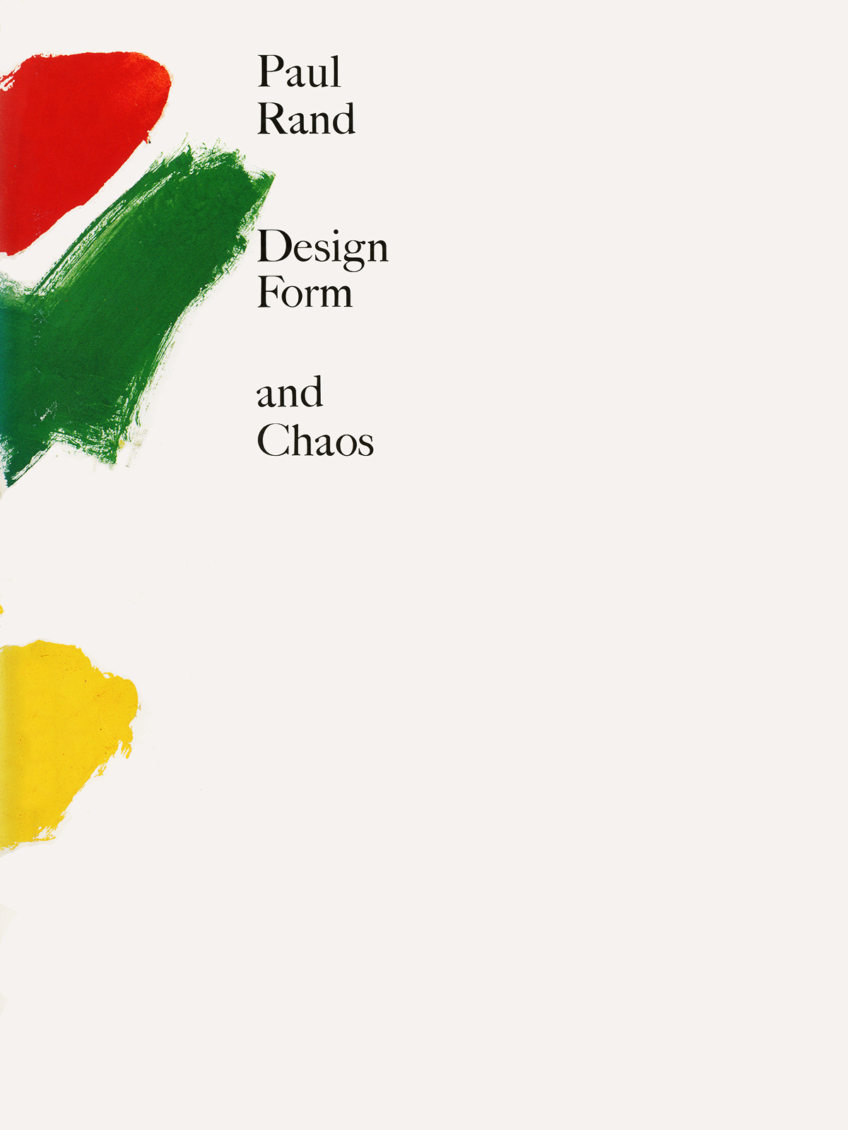
As well as some of Rand’s writing about design, designers, and the teaching of design, the book contains a set of reproductions of some of the brochures he prepared for clients. These brisk presentations (to Next, The Limited, IBM, AdStar, IDEO and Morningstar) are neat demonstrations of how Rand’s talent as a salesman matched his skill designer.
The last book produced by Hyphen Press before they wound down their publishing activities, this is more a portrait of the relationship, between Hollis and the Whitechapel, than a monograph about the designer’s work (but to an extent it does that job well, too).
¶Richard Hollis Designs for the Whitechapel is available to buy online from Hyphen Press.
The refreshing rejection of didacticism Richard Hendel brings to the subject of book design here is equally evident in his follow-up, Aspects of Contemporary Book Design (University of Iowa Press, 2013). His writing about his own methods is lucid but not prescriptive, and his continuing curiosity about the discipline is evident in his investigation of other designers’ working practices.
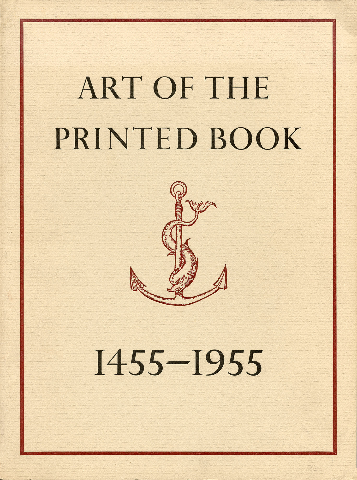
Reproductions of pages from 125 books selected from the holdings of the Pierpont Morgan Library, New York, published on the occasion of a 1973 exhibition. It includes an introductory historical survey, ‘The Great Printers and Their Books’ by the catalogue’s designer, Joseph Blumenthal.
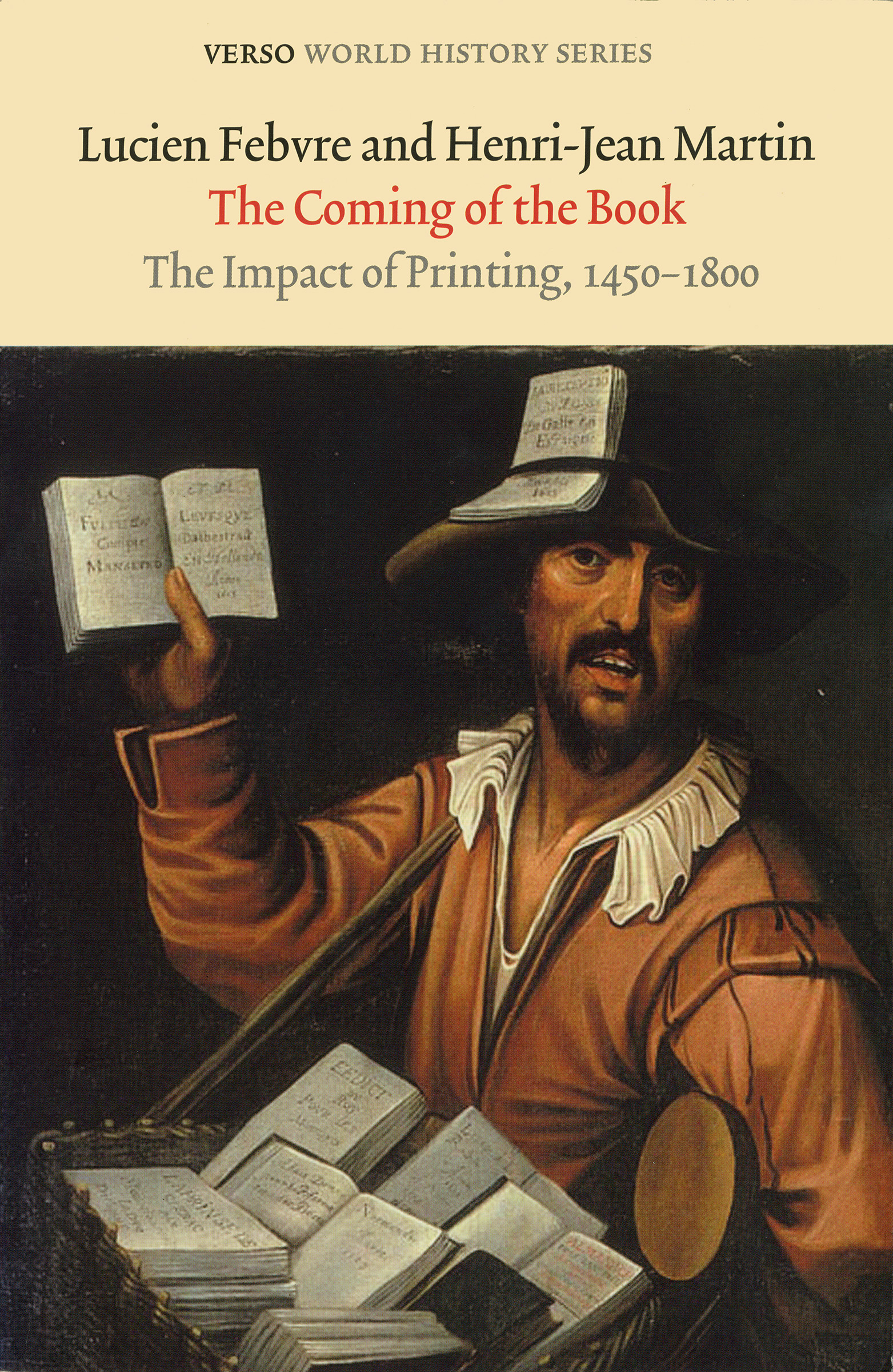
Verso / 2010 / 378 pp / Translated from the French by David Gerard / Edited by Geoffrey Nowell-Smith and David Wootton
Originally published as L’Apparition du Livre by Editions Albin Michel in 1958, Verso’s translation first appeared in 1976. An account of the political, economic, social and technological changes that came with the arrival of print, it is particularly useful on the development of book production and publishing in a European context.
¶The Coming of the Book is available to buy online from Verso.
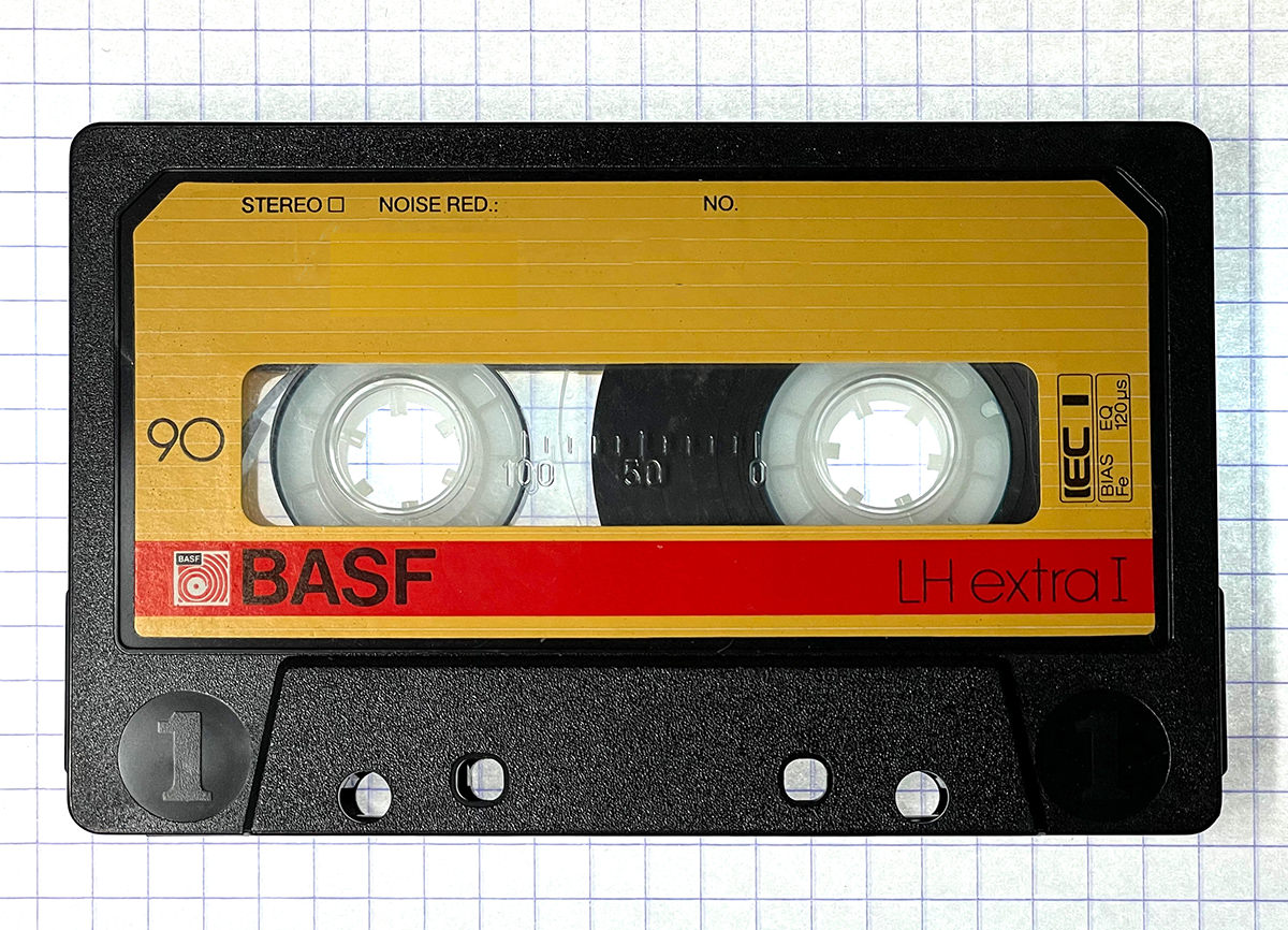
On his website, likeahammerinthesink, Calum Storrie has three posts filed under cassettes. There’s another very short one which could go there too, but he’s filed it under story. If you have 30 seconds to spare, read ‘Trip’.
¶Images. Any images included in this post may be used under the terms of the Creative Commons CC BY 4.0 license.
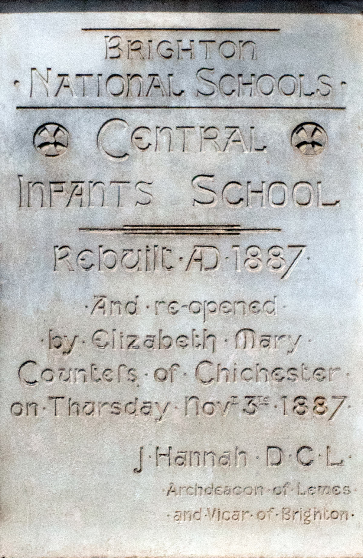
A handsome bit of 19th-century masonry. And ‘Counteſs’ rather than ‘Countess’ (or even ‘Counteß’) is fun. But 137 years later, it seems odd that the stonemason might have thought that future generations would be more interested in it having been a Thursday than that it was in Novr. The reason must be that the design would have either lost its nice pyramid with Thur · Novr – or the text of the date line would have had to be made noticeably smaller than the rest of the dedication with Thur · November. One may not be on oath in a lapidary inscription, but one has a duty to look presentable.
¶Images. Any images included in this post may be used under the terms of the Creative Commons CC BY 4.0 license.
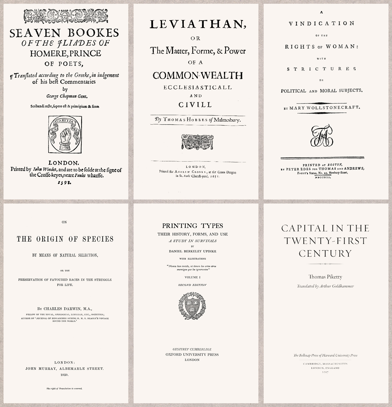
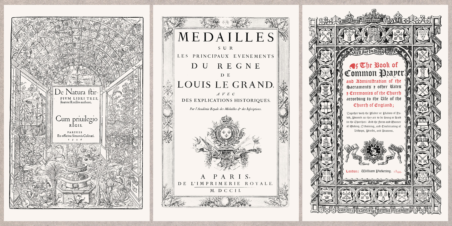
Typographers who specialise in the design of books – their insides, the pages – sometimes say that the title page is the book’s front door. Many designers of the outsides – the covers – would be more likely to nominate the jacket. The earliest printed books in Europe rarely had either. They were usually sold unbound and the text started on the first recto page. It was soon apparent that this made an indispensable part of the book vulnerable to damage and the beginning of the text was moved to the first verso, and the first recto was given over to the title.
In the fifteenth century, when paper was an expensive commodity, it was important to get the most out of every leaf. Paper makers acted as sorts of bankers to the print trade: before the arrival of paper money in Europe, paper itself was the credit they extended. As materials became cheaper, the title page gained a verso of its own. What was included on this first leaf, by regulation or custom, soon settled to a form which is essentially the same as one finds in books published now: the title of the work, the name of the author, publisher, printer, and the place and date it was produced.
Alongside largely typographic pages like the ones above, decorative and illustrated pages combining type with engravings and etchings appeared. Printing pages in two colours had emerged almost at once: some copies of Gutenberg’s 42-Line Bible were given a second impression for red initials. But excepting illustration by hand, polychromatic pages were rare before the nineteenth century when chromolithography and other processes were refined.
Even when bound books became usual, printed dust jackets and covers were more than a century away. Some title pages started to do a new job of advertising the work: intemperate raids on the typecase and sensational spoilers avant la lettre rather than simple announcements of provenance.
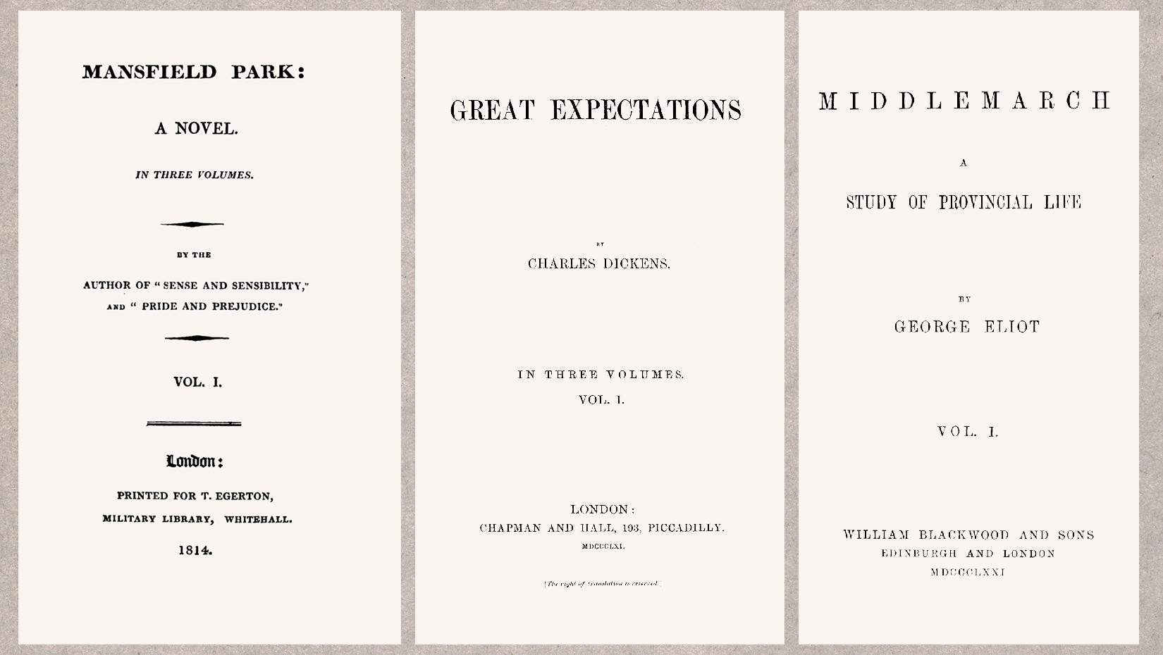
In the nineteenth century star authors no longer needed to market their work so aggressively. Jane Austen’s name never appeared on her books during her lifetime. The title page of Sense and Sensibility, her first novel, is credited to ‘A Lady’ and thereafter she maintained her modesty and let her previous successes do the bragging. A big name (or pseudonym) needed no further embellishment.
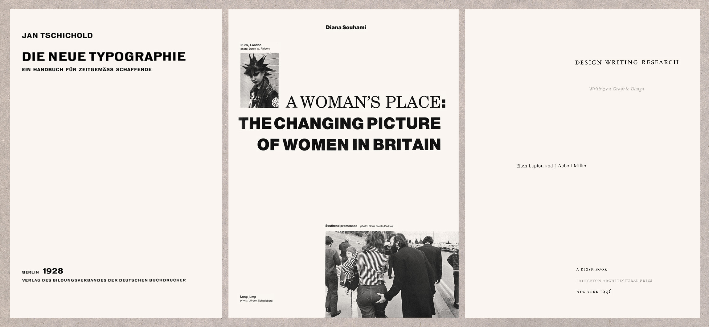
In the twentieth century pages were freed from an almost-universal symmetrical format, and photography and sans serif type, already common in advertising, started to appear more frequently in books as well. Centre-axis typography wasn’t replaced, but it became optional to do something else. Chief among the innovators of the new look was Jan Tschichold whose book Die neue Typographie (1928) became immediately influential and has continued to be so on successive generations of typographers. Even in books with a largely-traditional design, asymmetry has become a feature of title pages, a place where designers are sometimes given a freedom that publishers don’t allow them elsewhere. By 1947, when Tschichold was employed by Allen Lane to oversee the redesign of Penguin Books’ paperback series, he had more-or-less abandoned the aesthetic he had been instrumental in promoting and turned to a more classical mode. This alienated some, but not all of his peers and professional successors. Paul Rand, in his essay ‘A Mentor’ wrote:
Whether one talks about the New Typography and the old Tschichold or the old typography and the new Tschichold, one finds a common denominator which seems to embrace these apparently contradictory concepts, and which distinguishes all of Tschichold’s work. That is a sense of quality.
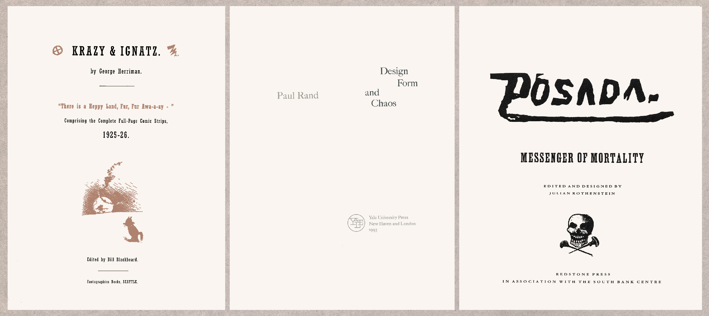
Sometimes the success of a page is owed to the circumstance of its designer’s relationship to the book’s subject. Chris Ware’s layouts for Fantagraphics’ reprints of George Herriman’s Krazy Kat strips cast the graphic eye of a cartoonist on the work of a professional forebear. The title page of Rand’s Design Form and Chaos comes with a sort of meta-illustration, being stamped with a publisher’s logo of the author’s own design. Julian Rothenstein, a tireless collector, preserver and publisher of images which have been considered disposable, starts a catalogue of surviving examples of the Mexican printmaker J.G. Posada’s work with a momento mori.
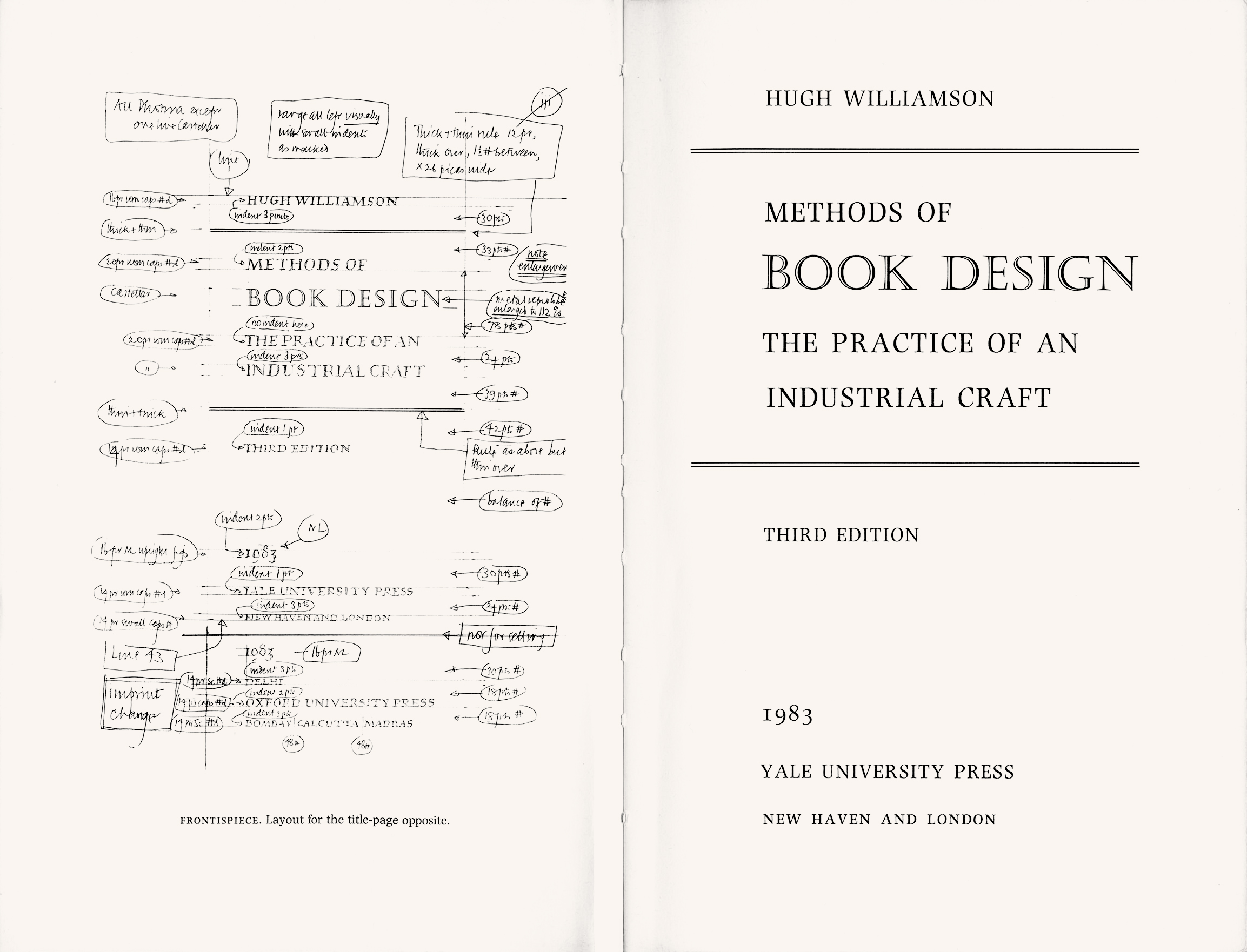
The graphic simplicity of some of the examples here belies the attention they might have been given. The spread below, the frontispiece and title page of Hugh Williamson’s Methods of Book Design shows that even before digital composition made the tiniest increments possible, typographers and compositors were arranging type to the precision of a typographic molecule, a single point: about ⅓ of a millimetre.
Or less. Tschichold advised an atom, describing the setting of titles as ‘the “art of the point”, indeed of the half-point.’
As new formal requirements have come along, other elements have started to appear on the title leaf. Rather than clutter the elegant entrance, some information has been pushed overleaf from the recto. These days the date of publication is usually on the verso, and printers’ details almost always. Novelties have turned up at different times, and for different audiences. For booksellers the ISBN and publisher’s contact details make ordering copies a bit simpler. Catalogue in Publication data, which can be useful for librarians, is now quite common. Authors’ incomes and reputations are protected by the copyright and moral rights statements, and publishers’ by the terms of sale (counterwise, the page provides a useful list of people and organisations to take legal action against if one believes oneself to have been plagiarised or traduced). The printer’s key, which indicates which print-run a copy belongs to, is there as a conversation between the printer and the publisher, but collectors of first editions pay attention to it. Details of original publication for new editions and reissued titles is often useful to readers. Those who are curious about the design of a book are occasionally alerted to the typeface it’s set in and even the name of the book’s designer. Hugh Williamson cautioned that ‘this gathering of administrative trivia is not the milieu for a dedication’, but one sometimes sees that there too. There is an implicit suggestion in Williamson’s remark that the imprint page (as the title verso is also known) is a bit of a dumping ground: the doormat behind the front door. But even if it doesn’t present a great opportunity for originality, it can be telling. Ron Costley who had been in charge of design at Faber & Faber said, when interviewed by Richard Hendel:
When I am asked, ‘What do you think of this book design?’ the first page I turn to is the title verso. It gives me a clue about the control a designer has had over a book and the care that has been exercised.
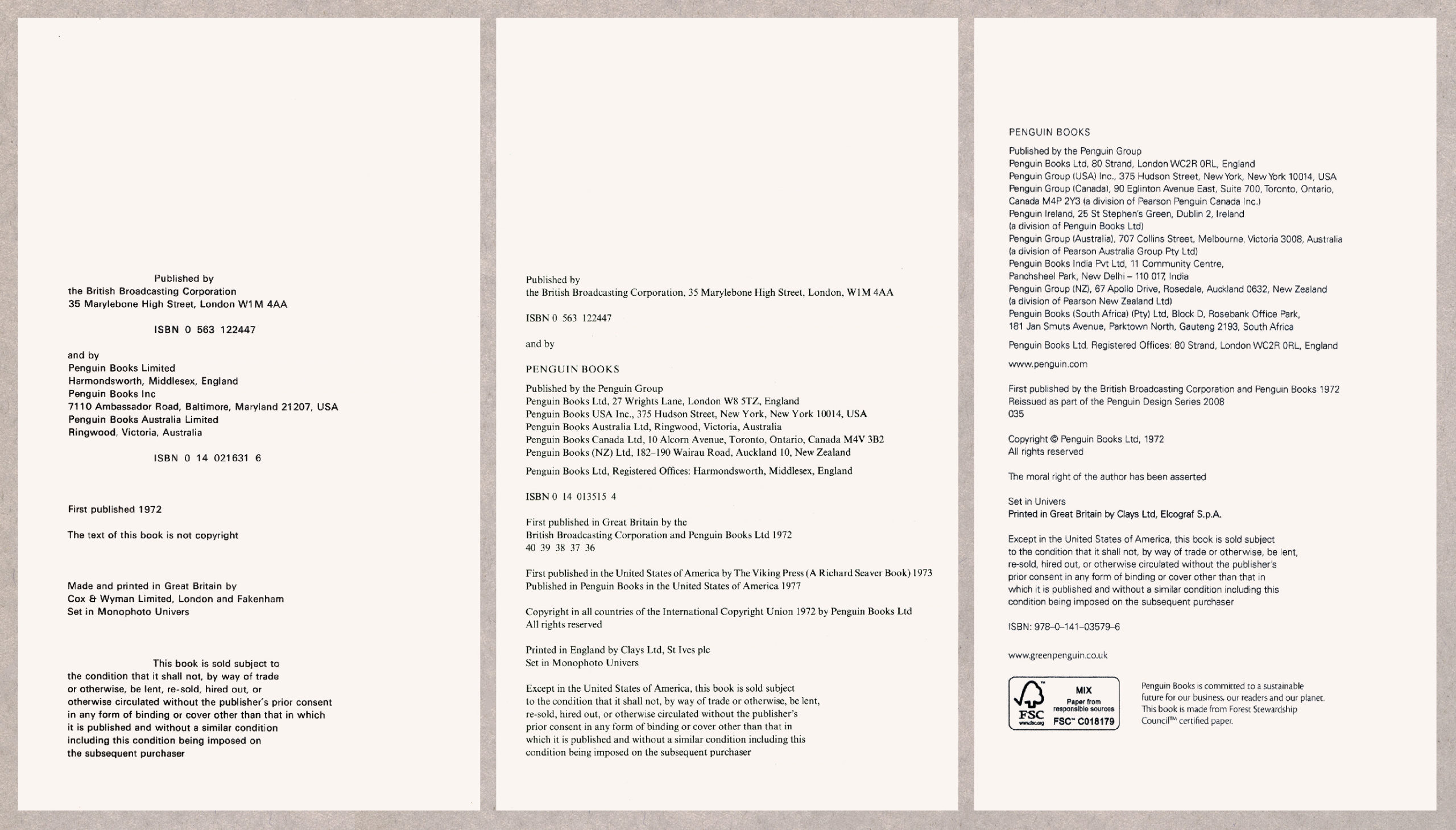
A note at the beginning of Ways of Seeing, co-published by the BBC and Penguin to accompany the 1972 TV series, says ‘A book made by John Berger, Sven Blomberg, Chris Fox, Michael Dibb, Richard Hollis’, but the text was Berger’s and the book’s design was Hollis’s (he also designed A Woman’s Place, shown above). The appearance of the book has been practically unchanged in the editions released since it was first issued. It has the status of an exemplar of modern typography in Britain and there would be much more to be lost than gained by having it redesigned. Hollis has said that the book isn’t a piece of work he has particularly strong feelings about, and that he always considered it ‘just another job.’ Nevertheless, its reputation among others has seen it recommended as often for students of graphic design as it has for those of art history: a wide appeal which accounts for many of its cumulative sales of 1.5 million copies in Britain alone.
A part of the book which has changed is the imprint page. In the first edition the layout is of a piece with the rest of Hollis’s design, all text set, like the rest of the book, in Adrian Frutiger’s typeface Univers, with some lines emphasised by deep indentation. In subsequent editions the integrated design has been neglected. The text expanded in the 1990 version with additional addresses of Penguin’s international operations, and Univers was replaced by Times, laid out in Penguin’s boilerplate of the period. The printer’s key has appeared too (the second of the pages shown below came from the book’s 36th print run). In the most recent edition, issued in a smaller format in 2008 as part of the Penguin Design Series, the type has reverted to Univers, and with the addition of even more international offices, a moral rights statement and Forest Stewardship Council credentials, the text now takes up almost the full depth of the page.
One detail of the first edition hasn’t made it into subsequent ones. A major part of Berger’s thesis in Ways of Seeing concerns how representation in art, and ownership and control of artworks, have been used to shore up existing social, gender and political hierarchies. With this in mind, it is unsurprising to see that Berger chose to eschew ownership and control with the explicit statement ‘The text of this book is not copyright.’ It is a curiosity that in the newer editions, copyright has been retrospectively assigned to Penguin Books.
My father, Peter Campbell, was art editor at BBC Publications when Ways of Seeing was being produced. He was a book designer too, and although generally his own typography was more traditional (among the books he edited and designed for the BBC was the one accompanying Kenneth Clark’s series Civilisation: very much the sort of art history Berger thought in need of revision), he admired Berger’s text and Hollis’s design, and certainly didn’t think it was his place to try to impose a style on another designer’s work. Hans Schmoller, his opposite number (and Tschichold’s successor) at Penguin, was less sanguine. On receiving a copy of the finished book he hurled it from his office in rage. Perhaps if he’d responded less explosively he might have taken the time to look at the imprint page, and have seen that when the first edition sold out, as it soon did, he would have been quite free to get someone to start the job all over again. It is very unlikely that this would have resulted in a more successful book by any measure.
Cookies are used to deliver the best experience on this website. If this is unacceptable to you and you wish to continue to use this website, your remedy is to block cookies for hellbox.co.uk